Kiosk Redesign
Starbucks
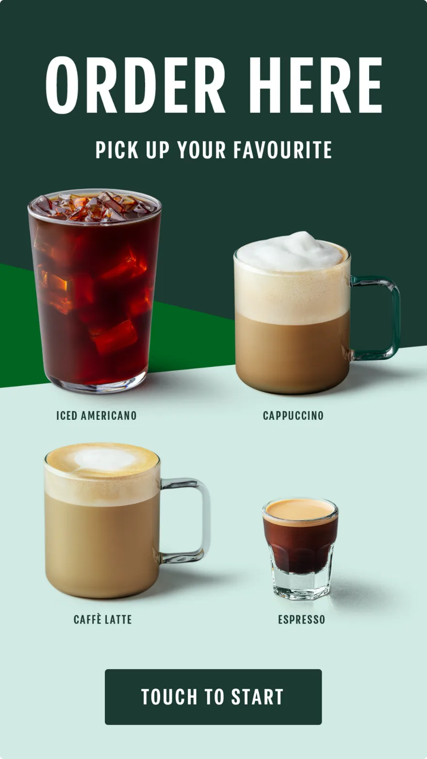
Kiosk Redesign
Working alongside another UX designer within the team, I was tasked with designing a dynamic, engaging interface that moved beyond the constraints of the screens currently used in Starbuck's on-the-go machines.
Here's how we got there...
01
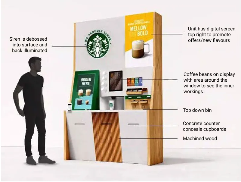
This is the unit the kiosk sits in. Vertical screen, eye level, flanked by digital displays pushing offers and new flavours. Promotion was handled elsewhere, so the journey itself could stay purely functional and get people ordering fast.
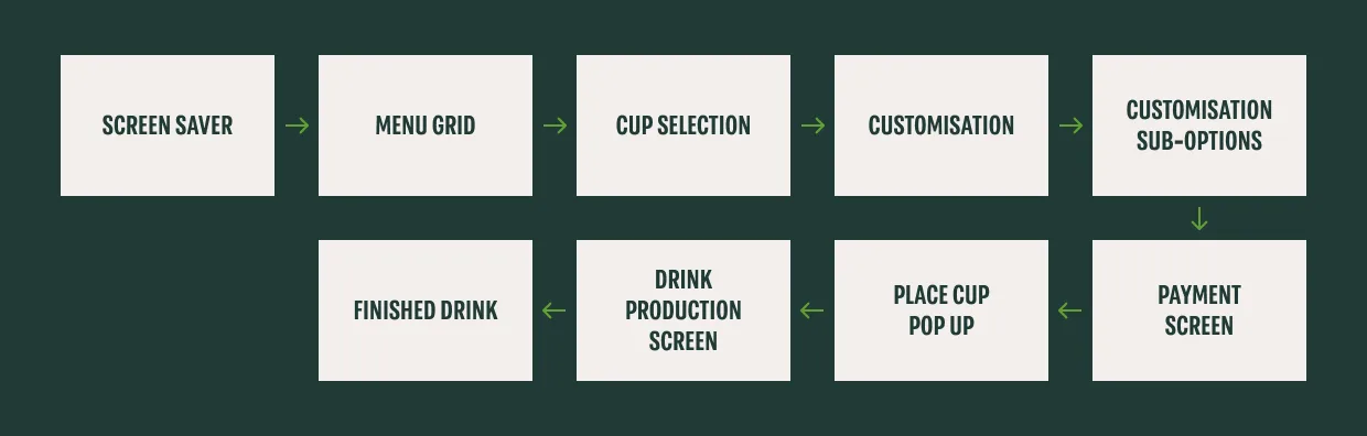
The resulting ordering flow is illustrated here. A workshop was held to define this journey and ensure the fastest possible route to order.
02
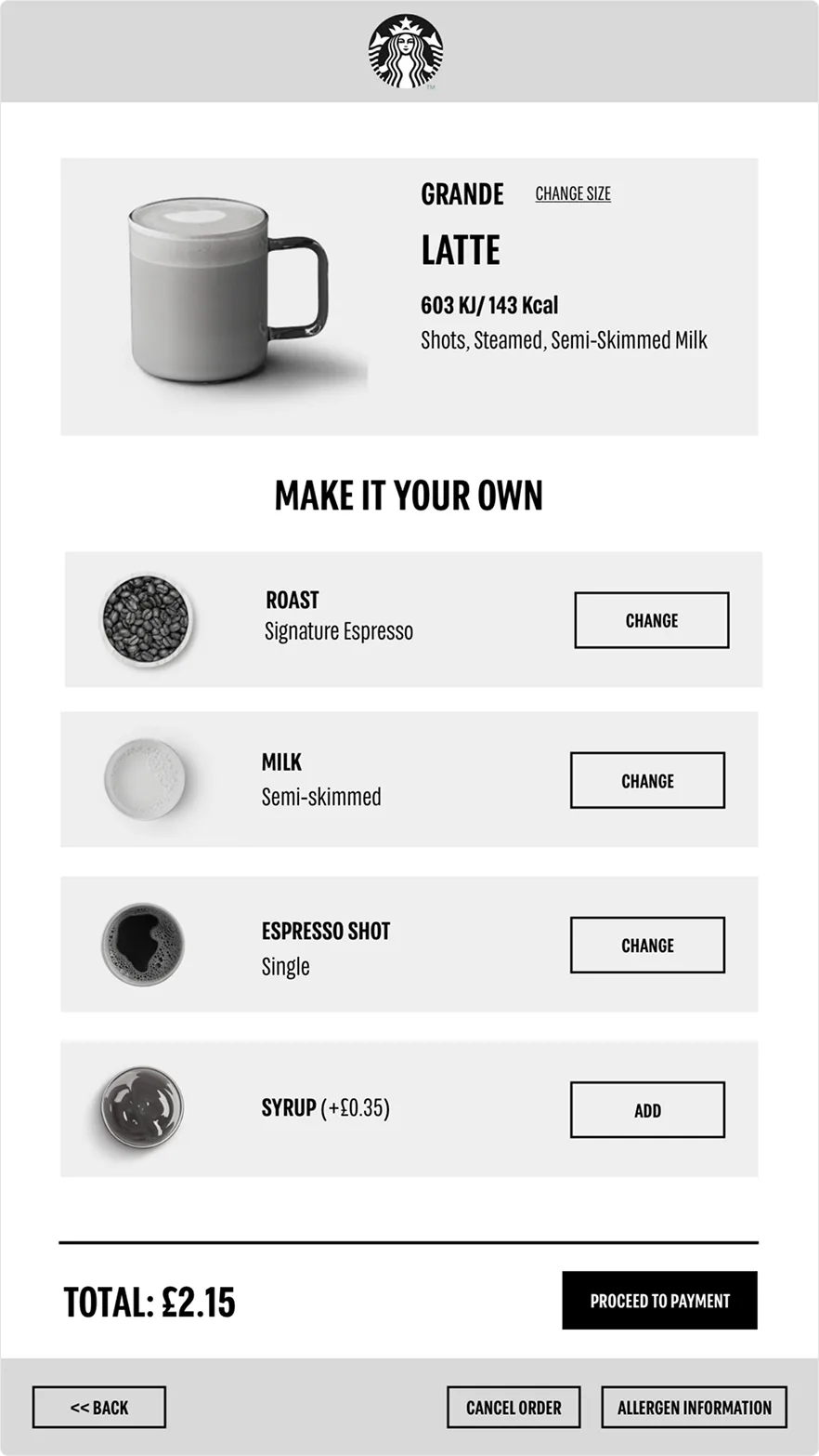
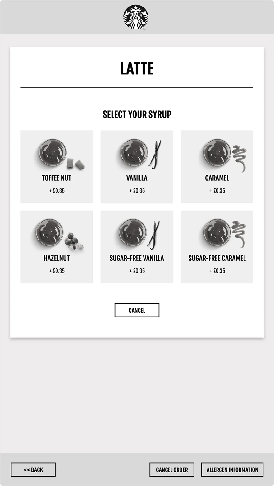
From these flows, customisation was the main sticking point. Our first low-fidelity concept went to ten users to test, and the results were mixed, four of them were frustrated at having to jump between screens just to change more than one option.
Useful feedback. It told us exactly where to aim next.
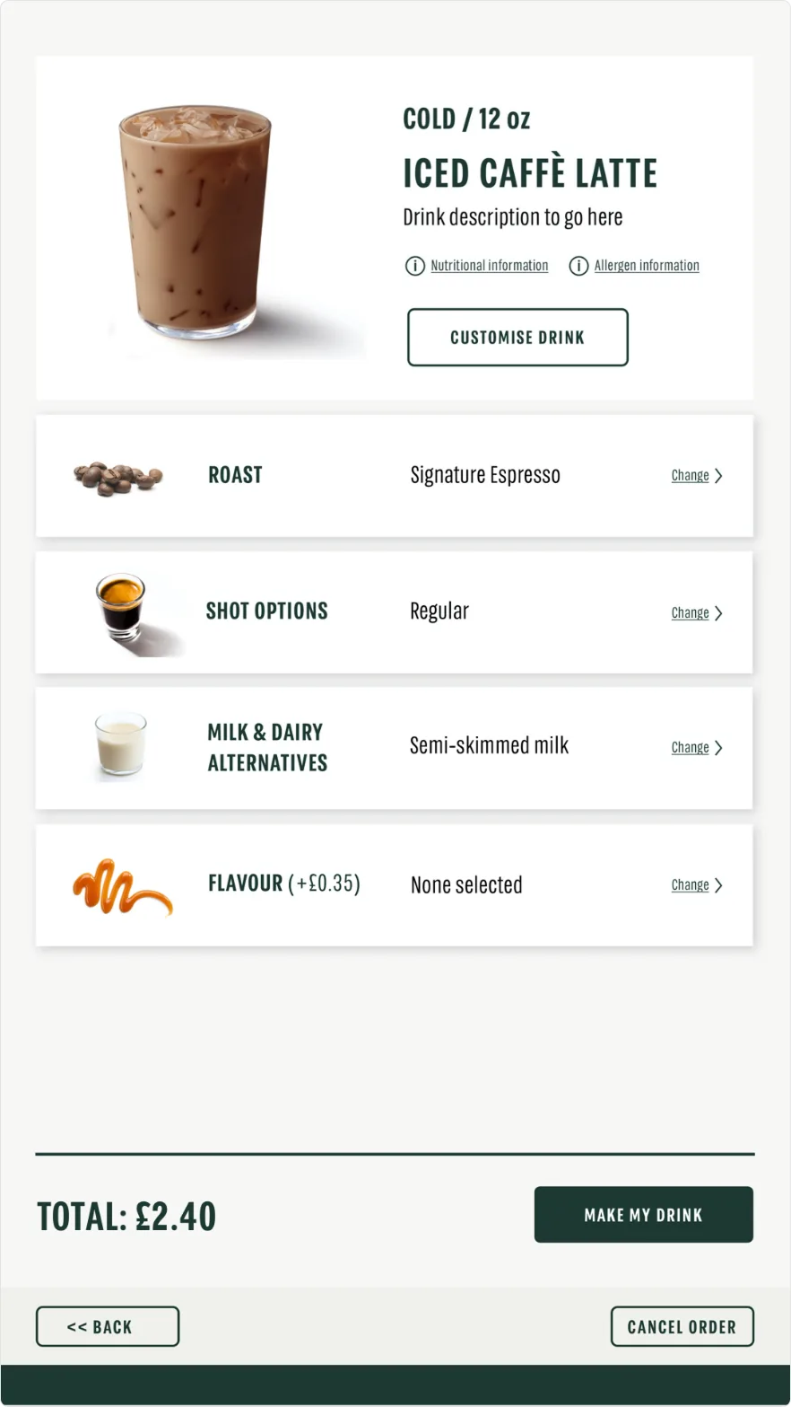
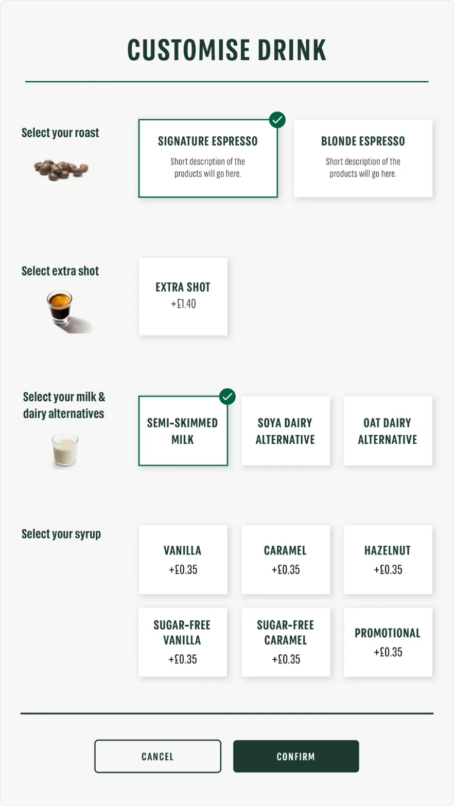
The same users saw the updated version. The response was markedly better, customisation now lived on one screen, whether you were changing one item or three.
We held onto that principle, fewest screens as possible, every time.
03
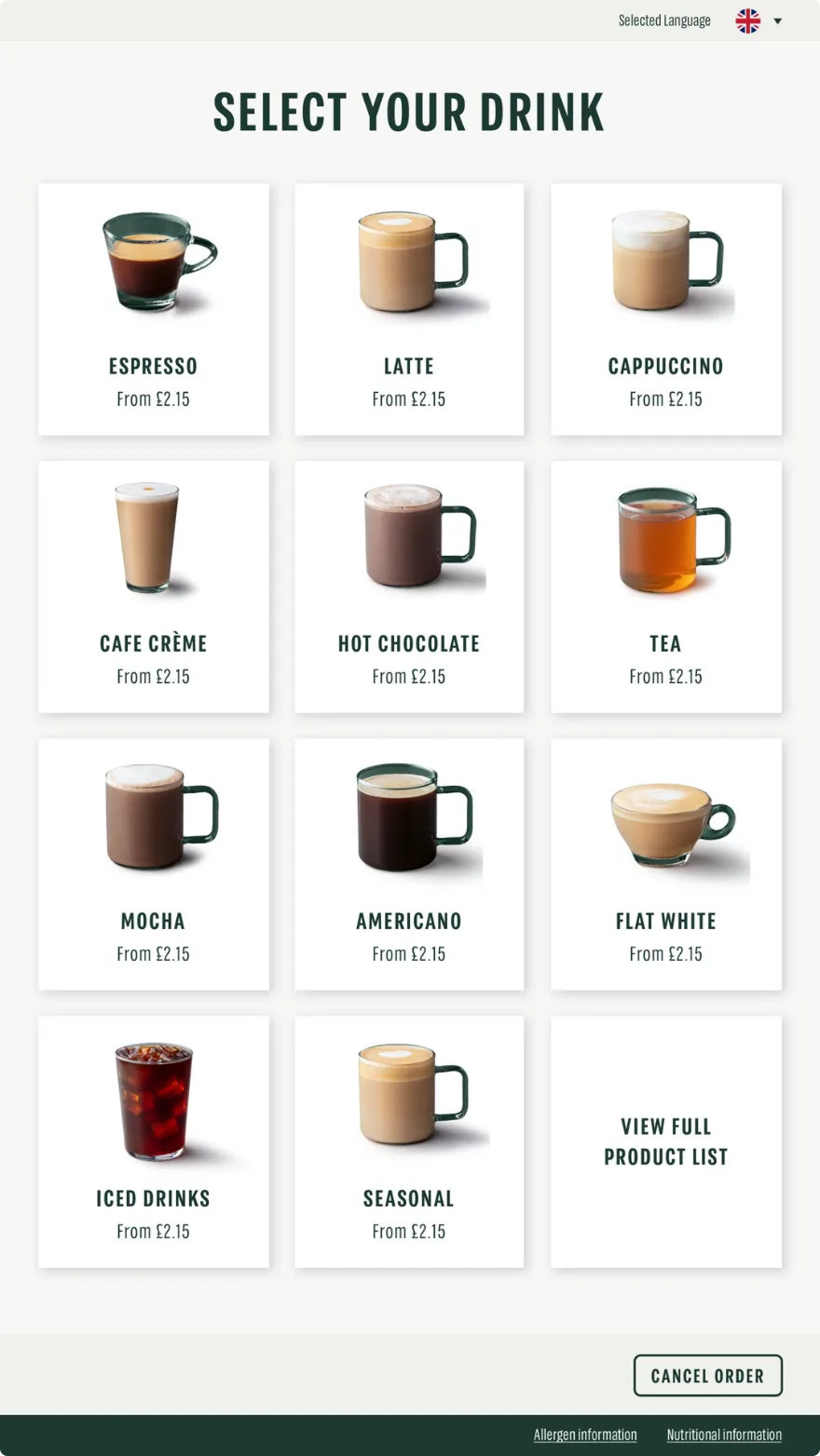
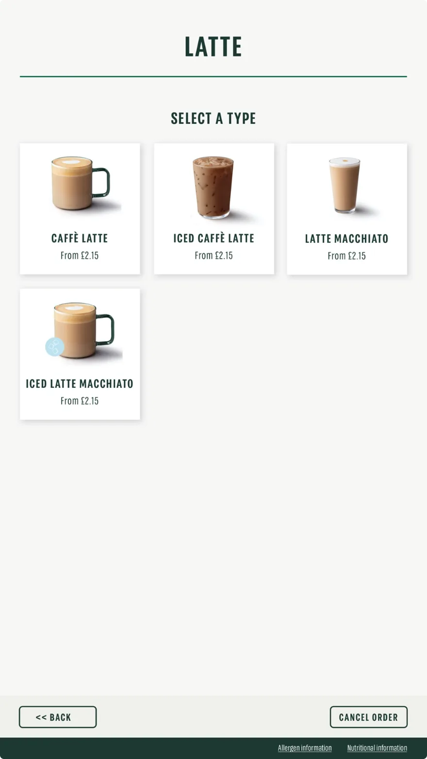
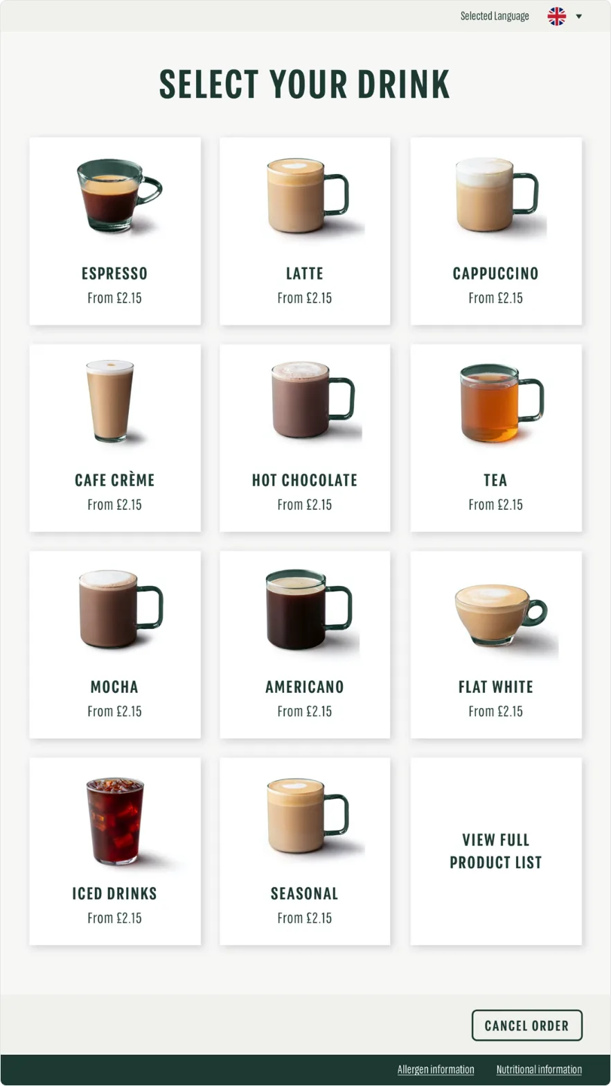
These principles carried into other parts of the journey. Drink selection, for example, is ordered by most popular items. We could have shown every option in one scrollable list, but feedback told us this felt overwhelming, so users pick a drink type first and refine from there. A separate view lets them browse the full list if their drink isn't on the initial screen.
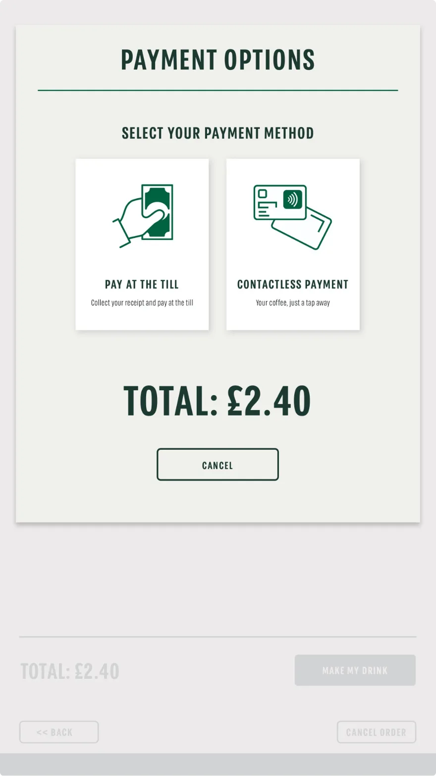
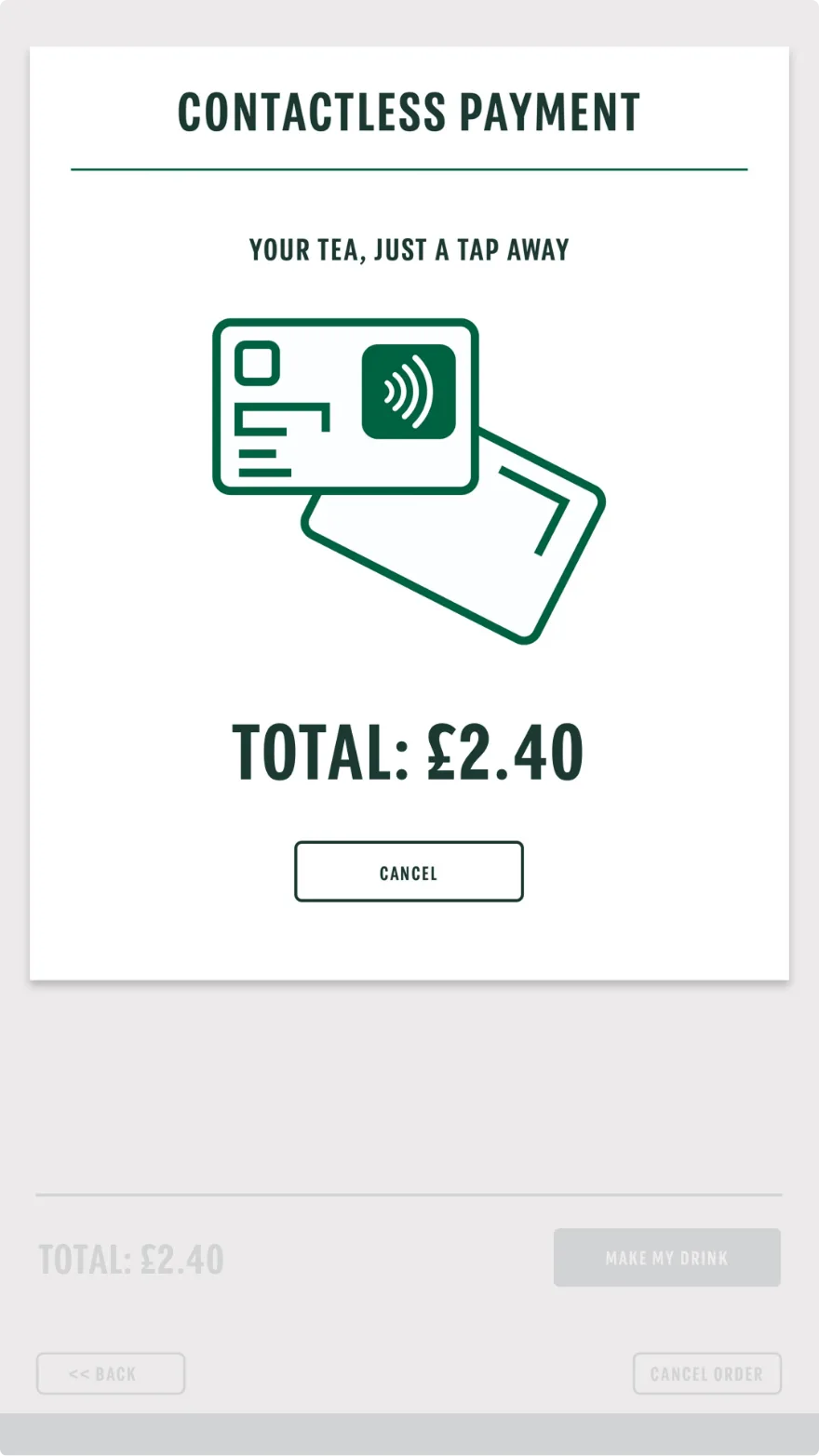
The same principles were applied to the payment options screen, where information is presented at a large scale and kept concise, supported by illustrations to guide the user.
04
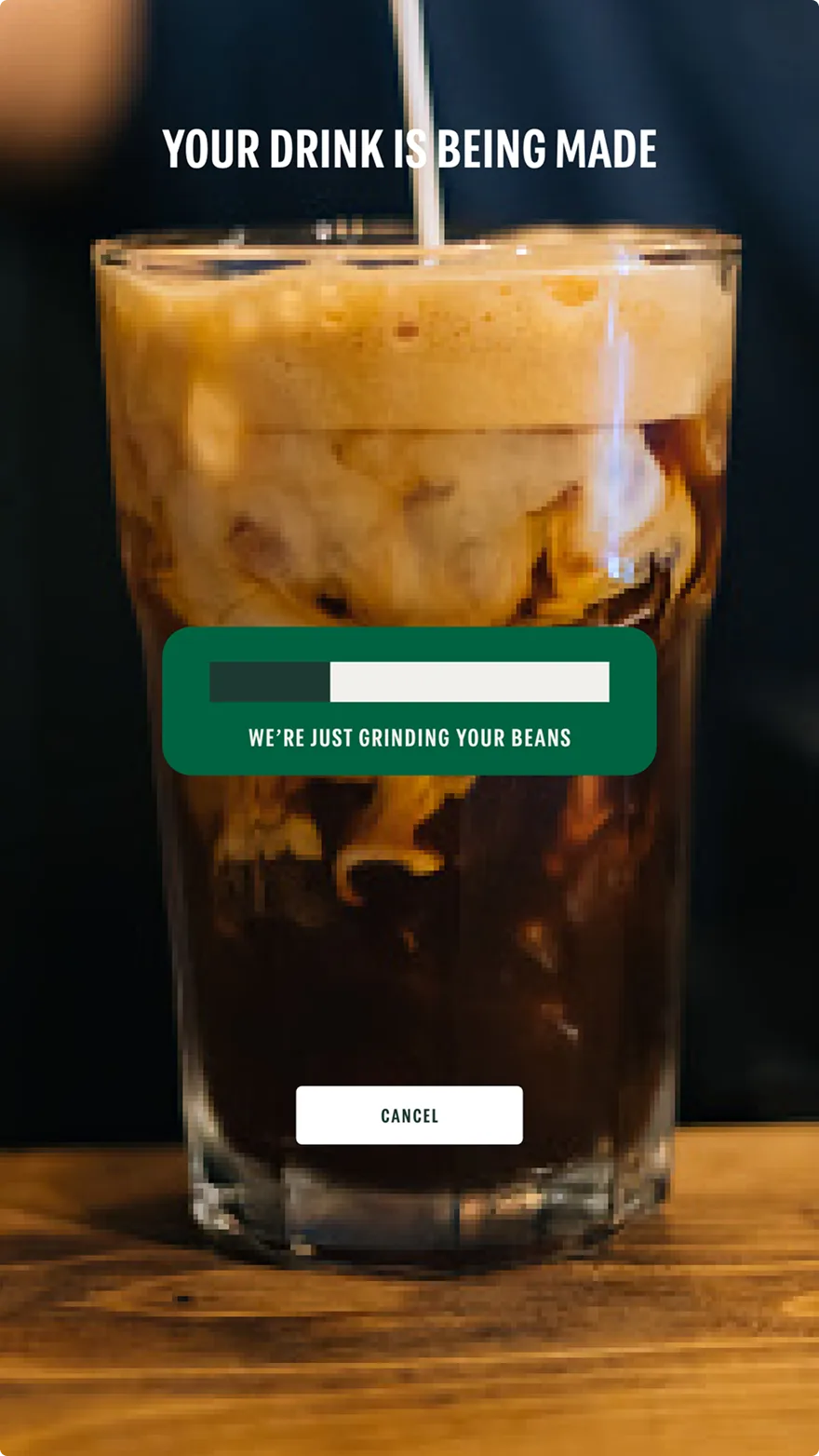
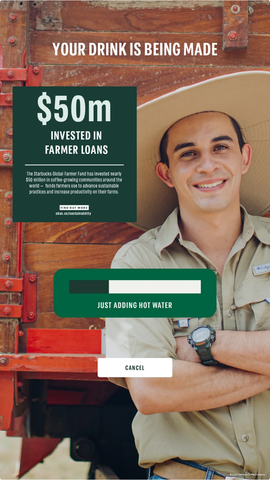
Additional messaging was not initially within scope, as the focus was the ordering journey itself. However, an opportunity emerged in the period while the drink is being prepared. Rather than a visual of beans being ground or milk being added, the decision was taken to focus on sustainability messaging, which avoids competing with the adjacent offers screen.
The Results
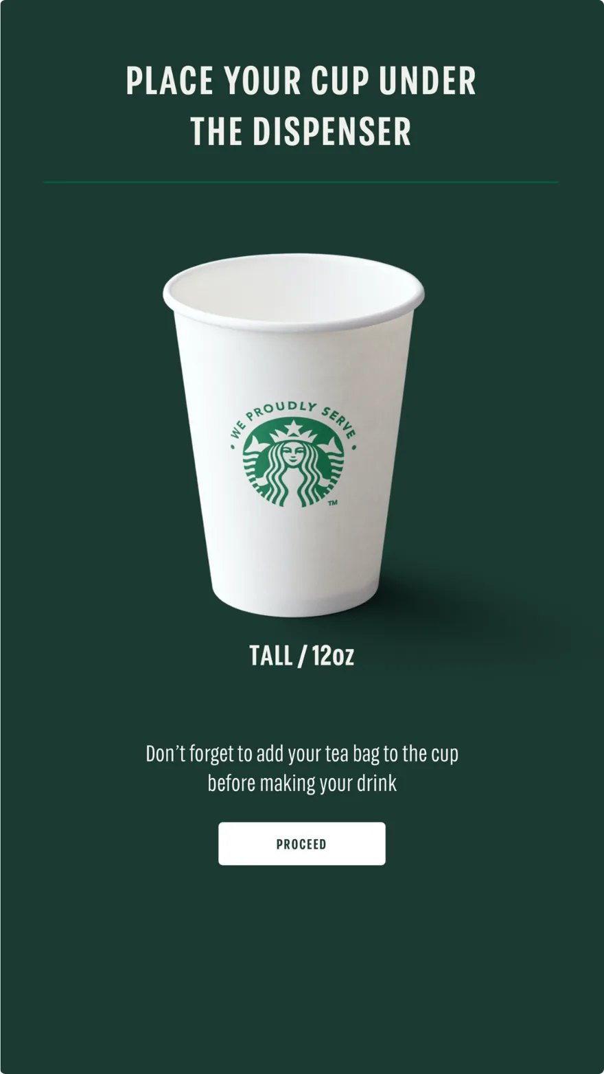
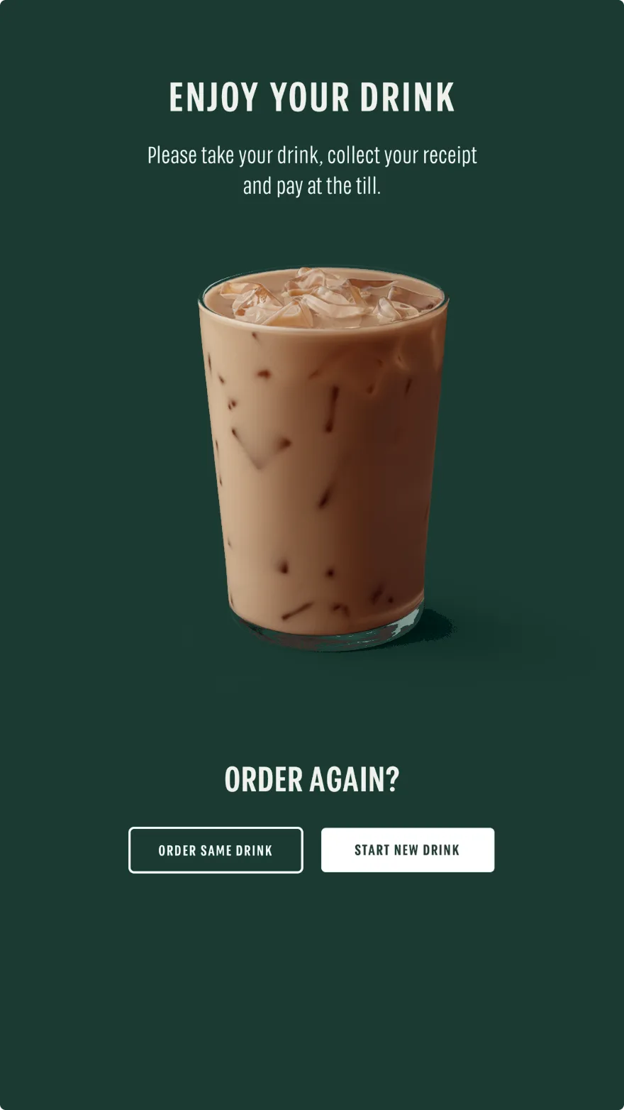
The final round of testing confirmed the original issues were gone. From there, the concepts went to the Starbucks development team, with the plan to rejoin once they were live on the kiosks and ready to test.