Personal Details
Personal Details
HR teams were spending excessive time navigating the details screens within People First, where an unclear information architecture was compounded by a cluttered interface.
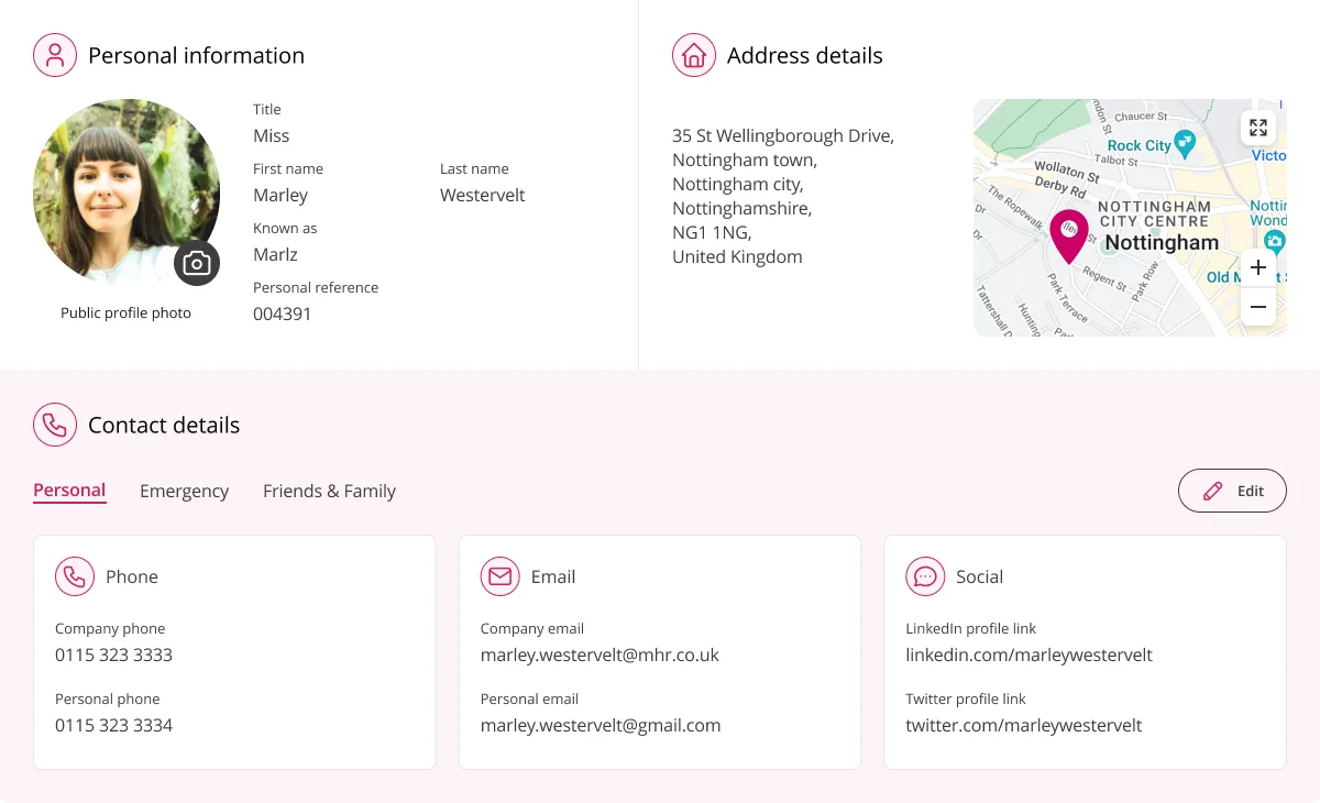
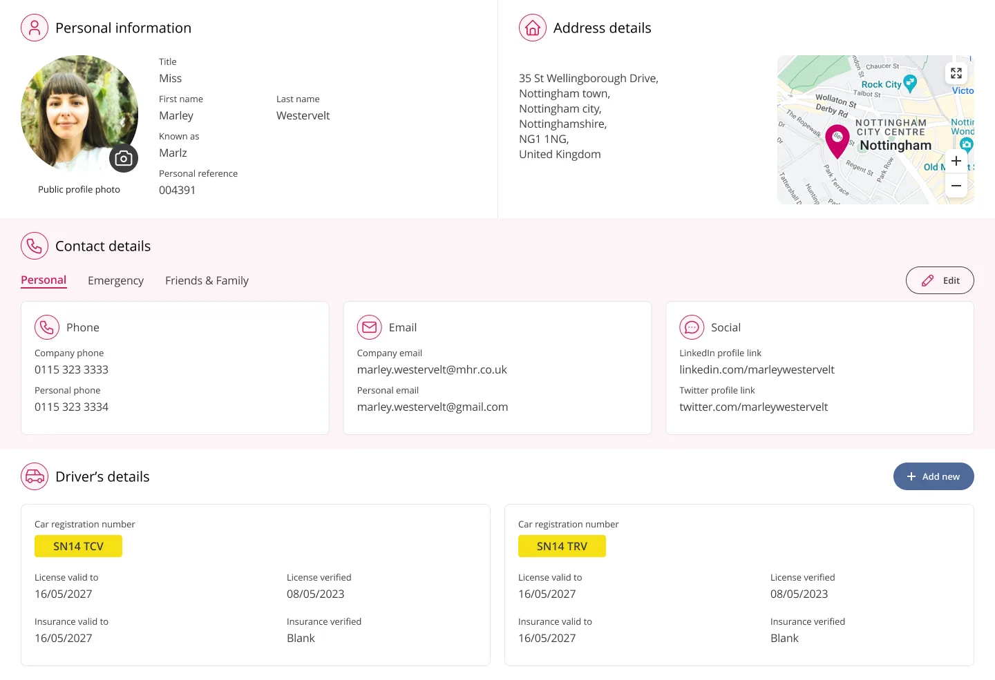
The details view was redesigned to provide HR administrators with an immediate, structured overview of employee information.
Here's how we did it...
01
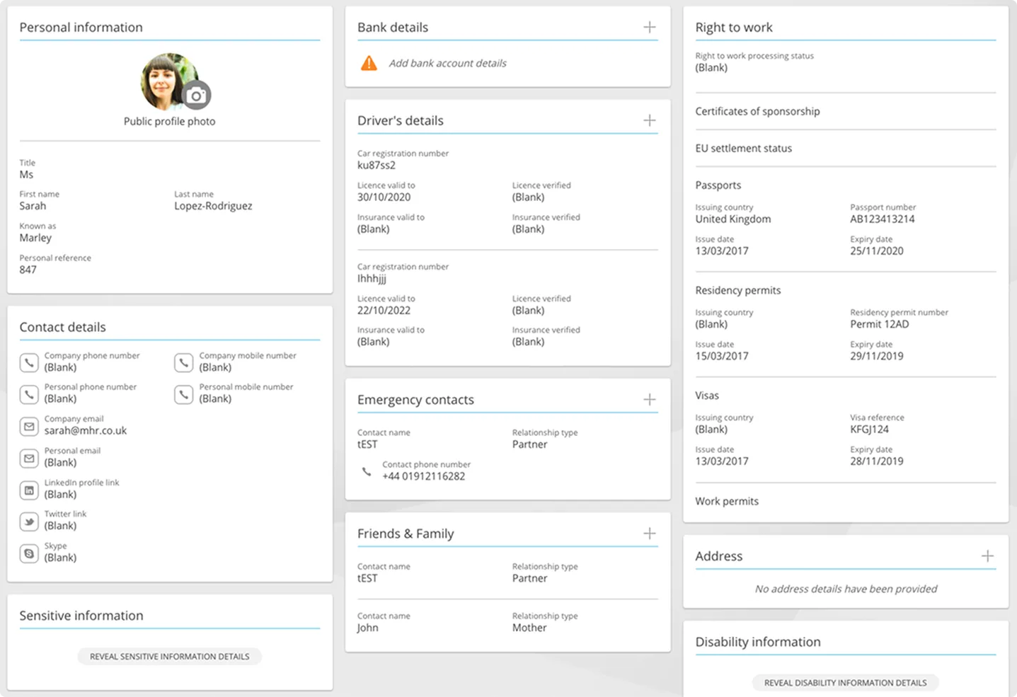
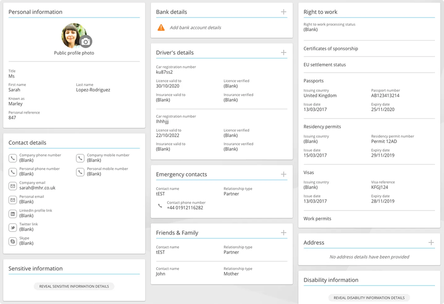
The previous details page is shown above. While there was clearly considerable scope for improvement, and I had formed my own view of the priorities, the primary audience for this screen is HR administrators, whose input was essential.
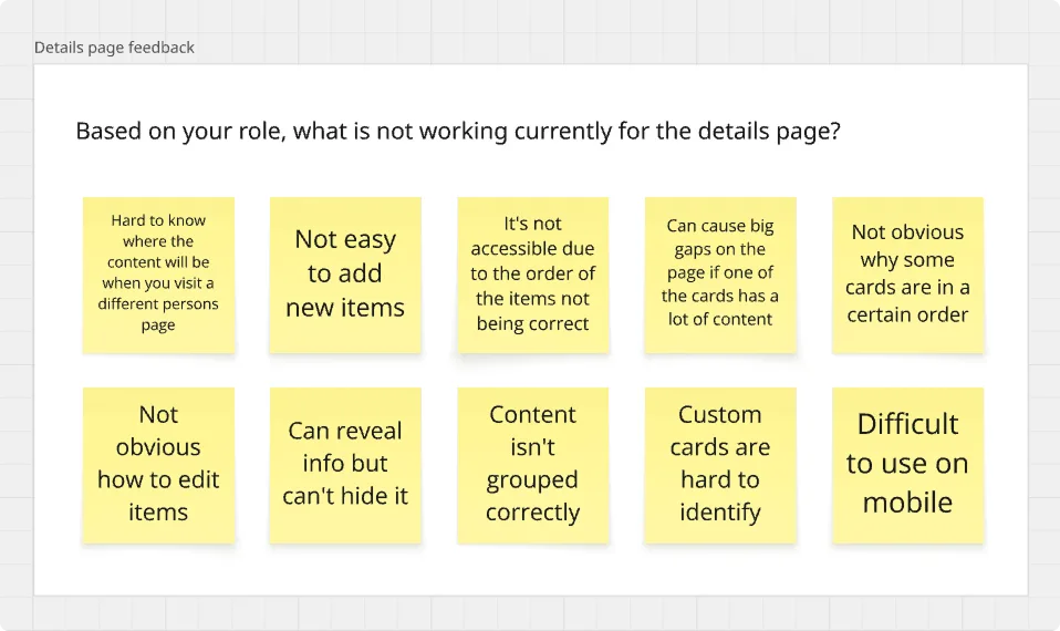
We ran workshops with HR admins, internal and customer-side, on the existing designs. The themes above became the benchmark for the redesign.
02
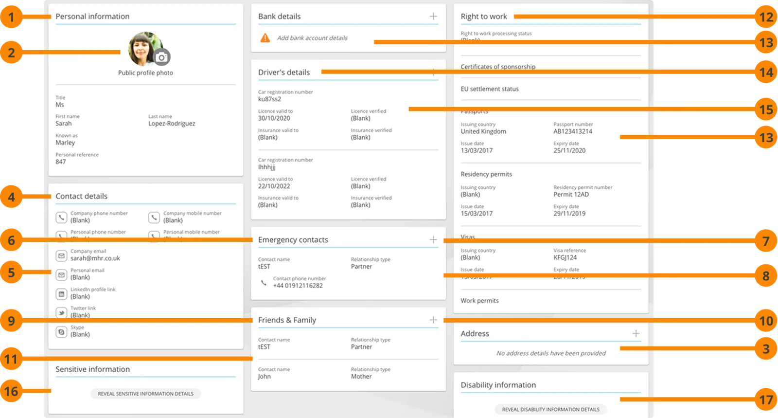
In addition to the feedback above, the most critical issue to resolve was the order in which page items were announced to screen readers.
Because the cards were arranged in a flexible layout driven by the content present, their order varied from record to record. This meant screen reader users encountered no consistent reading order between profiles.
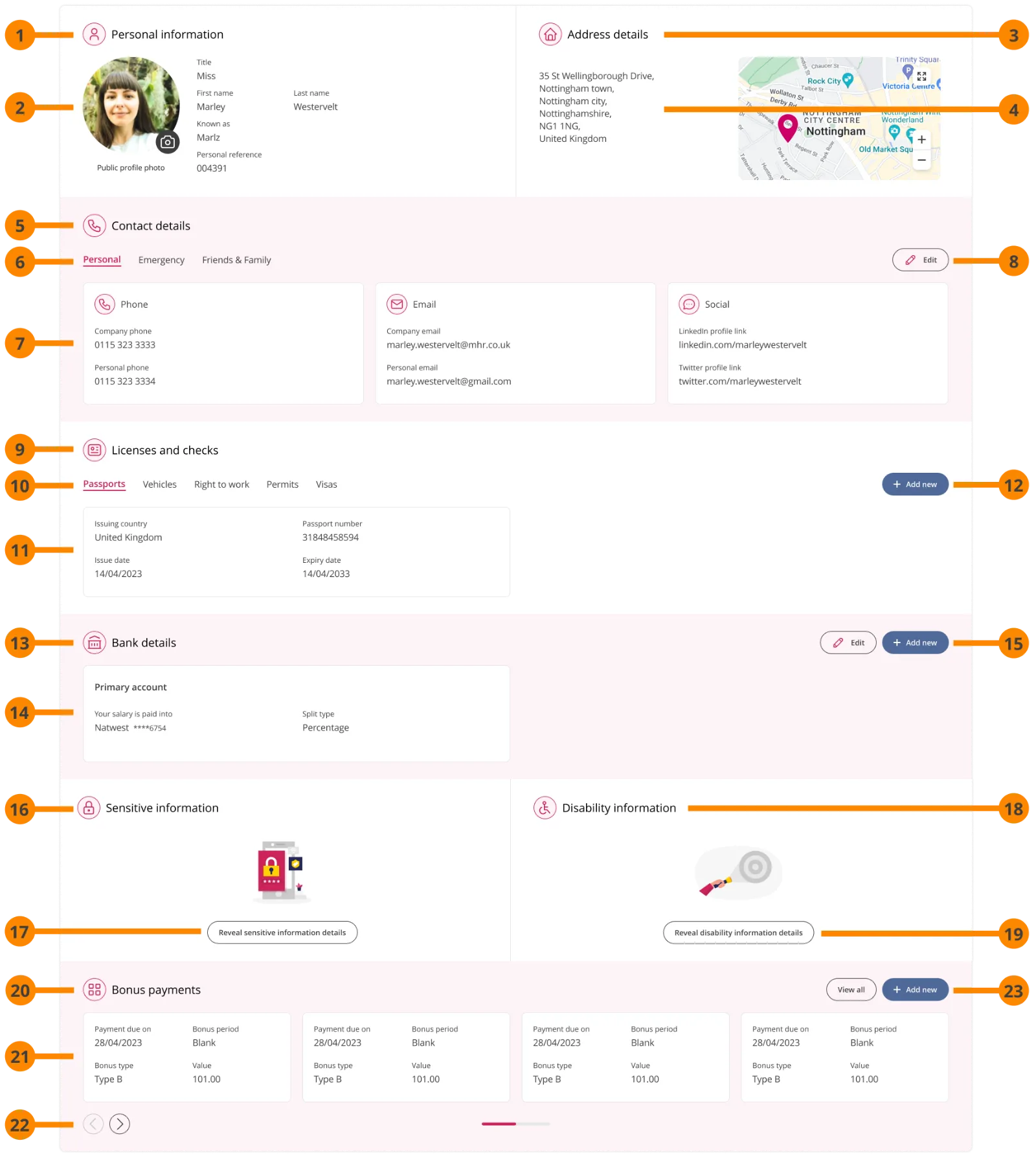
The redesign resolves this by fixing the position of each section, ensuring a consistent reading order between cards and across employee records.
03
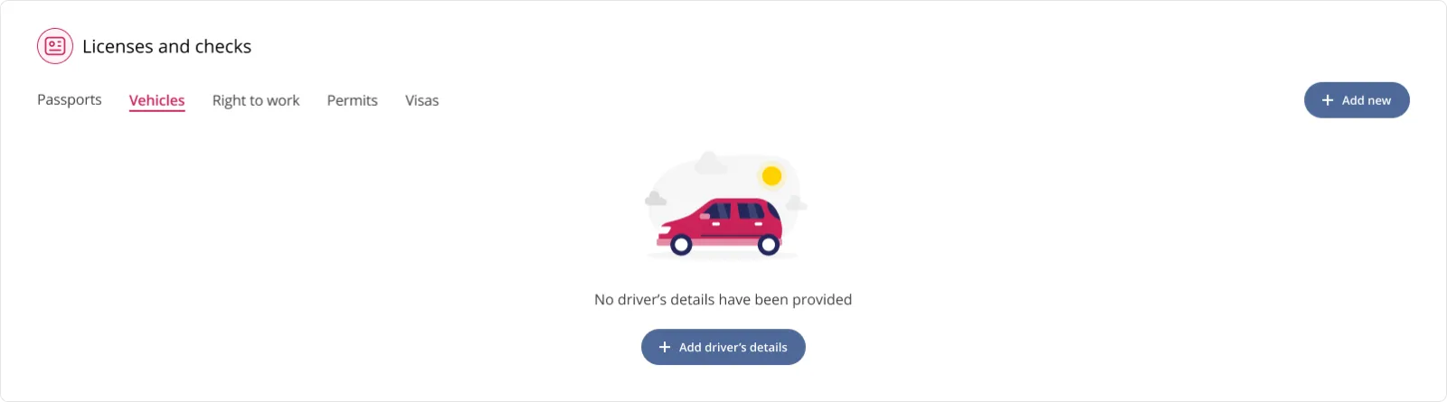
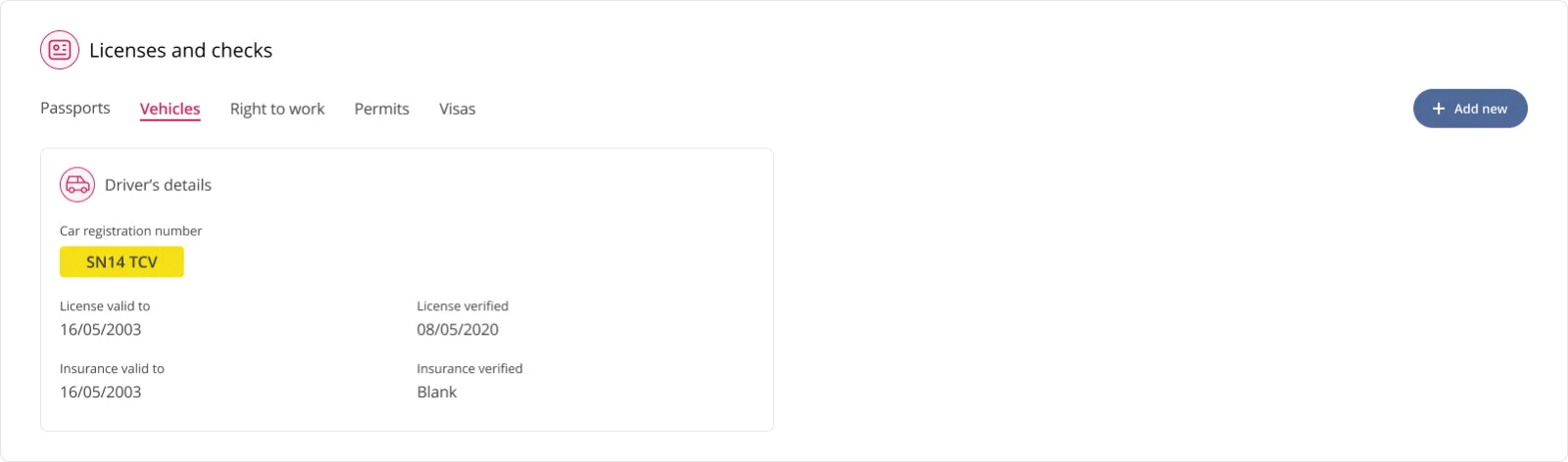
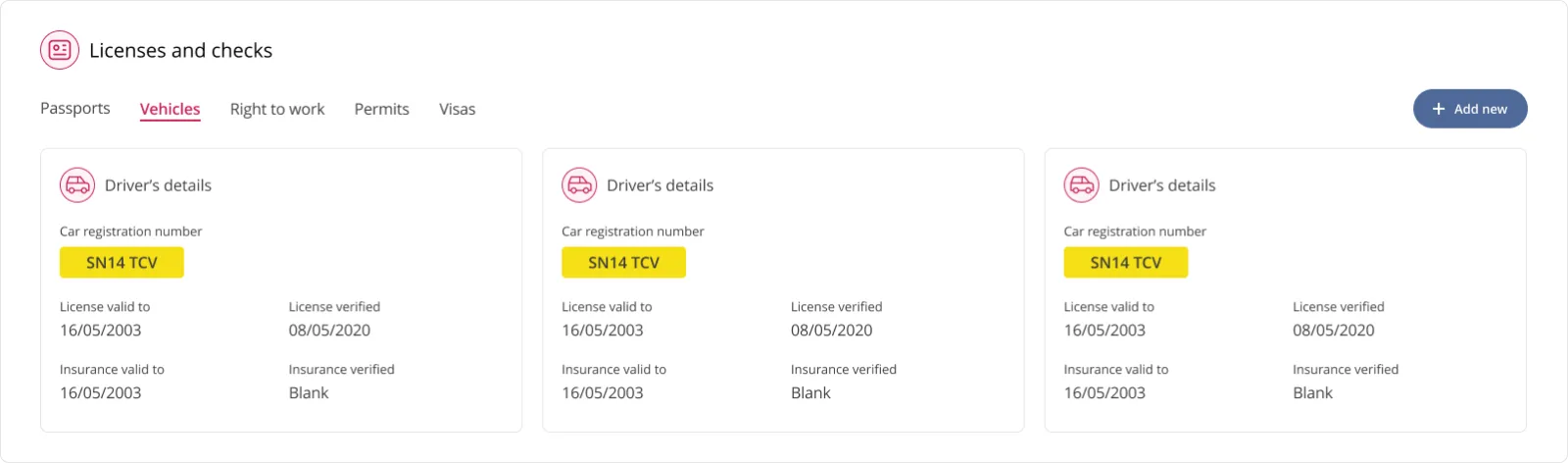
The existing cards lacked hierarchy, and their position varied unpredictably between employee records.
The updated design segments content by type, fixing each section in a consistent position. Replacing the masonry grid with organised rows allowed content to scale in a more controlled manner. As the example above demonstrates, a section can be presented in a number of ways depending on the volume of content it contains, while its position remains constant.
04
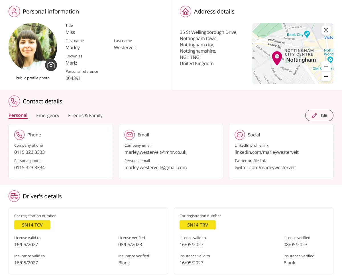
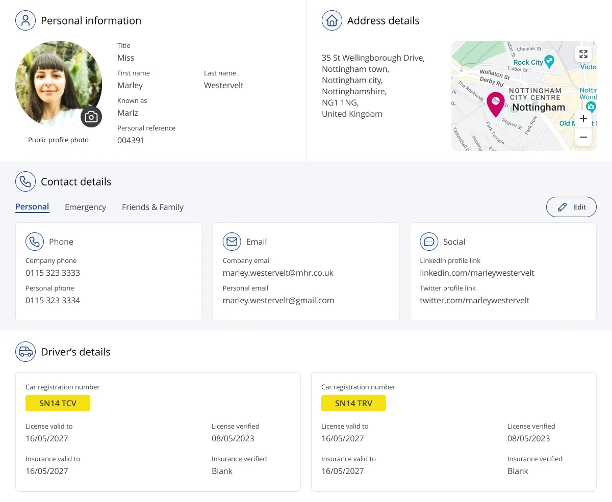
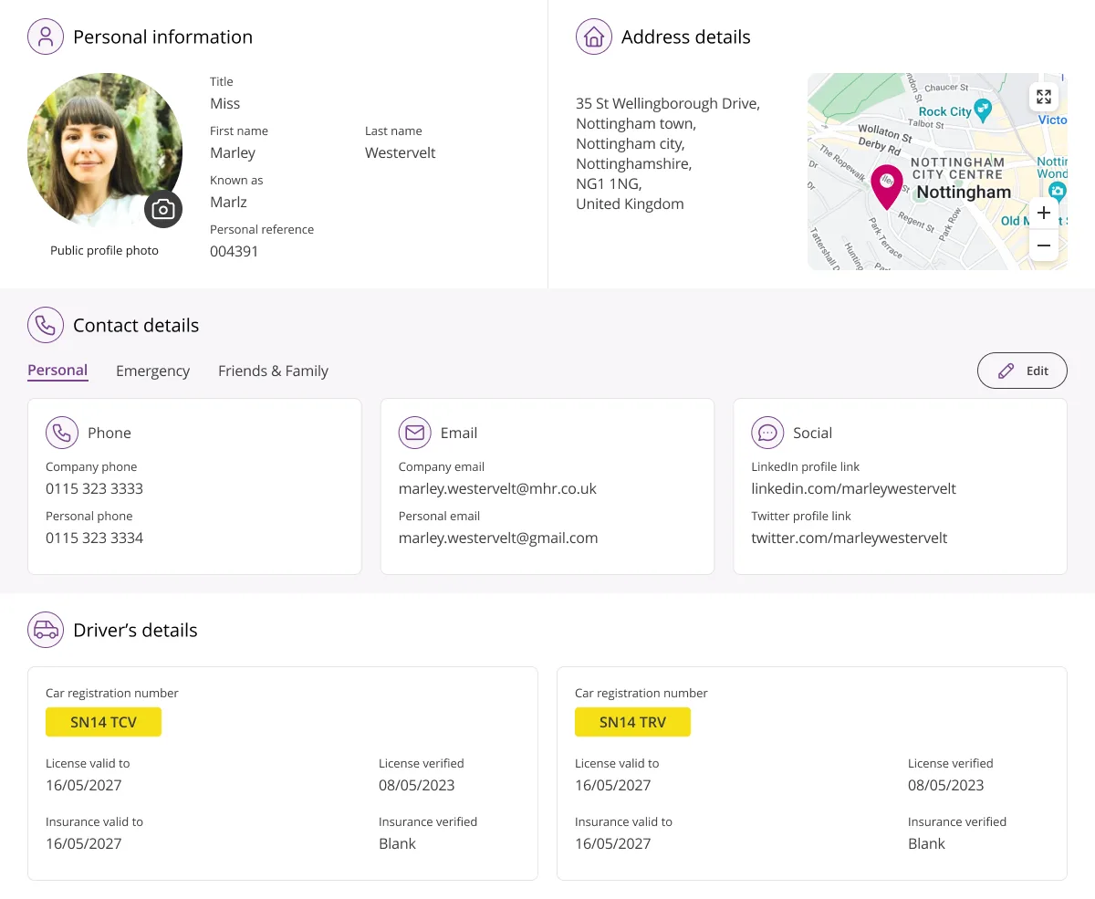
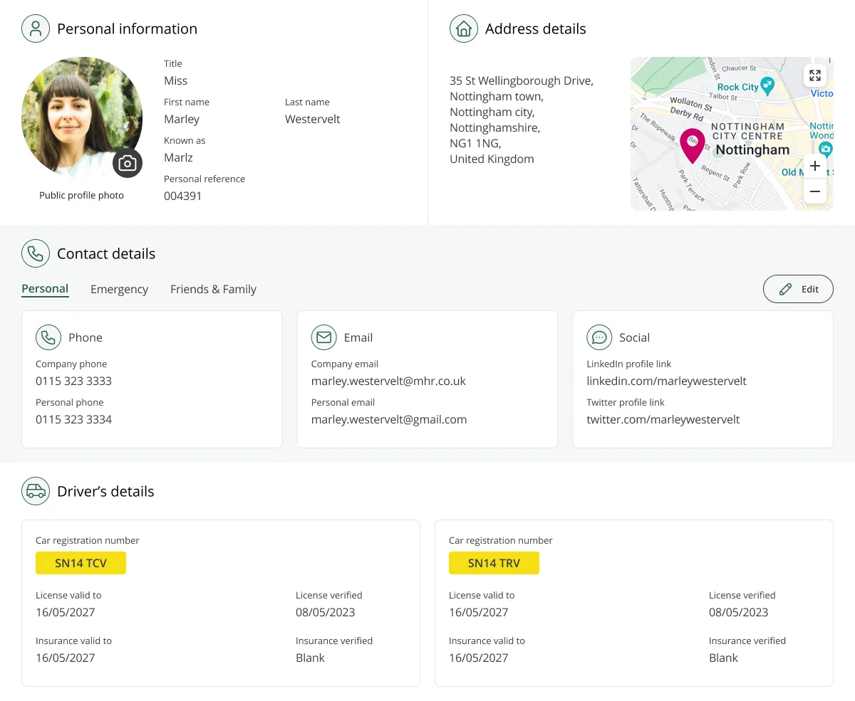
Colour themes were introduced to allow organisations to apply their own branding and personalise the product accordingly.
The interface adapts to the selected theme, maintaining a consistent aesthetic across the application.
Given the emphasis on accessibility throughout the redesign, all theme colours were required to meet AA contrast standards.
The Results
We put the QA build in front of the same HR admins who'd reviewed the old page. The response was immediate, cleaner, clearer hierarchy, fully accessible. Their only question was when they could have it.
Not long, as it turned out. The new layout launched alongside the theme colour work, and the admins we've spoken to since report real time savings.
It's now the reference point for other parts of the product dealing with dense content.