Product Selector
Boots
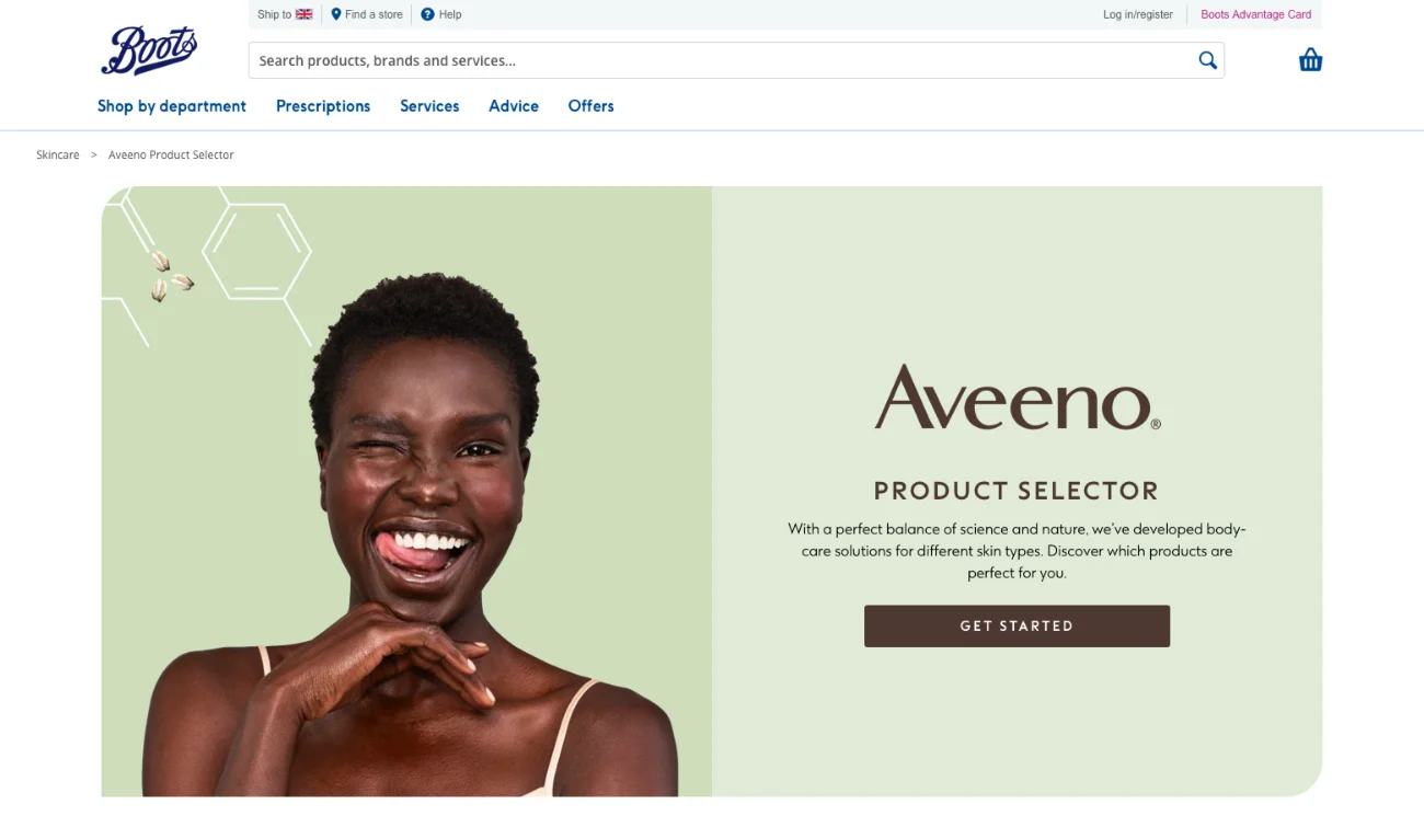
Product Selector
The project involved the creation of a series of product selectors for a range of brands, to be hosted on the Boots website. Each selector guides customers to a suitable product based on their responses to a tailored set of questions.
The central challenge was that a single layout had to serve every brand while presenting as a distinct tool in each case.
Here's how we approached it...
01
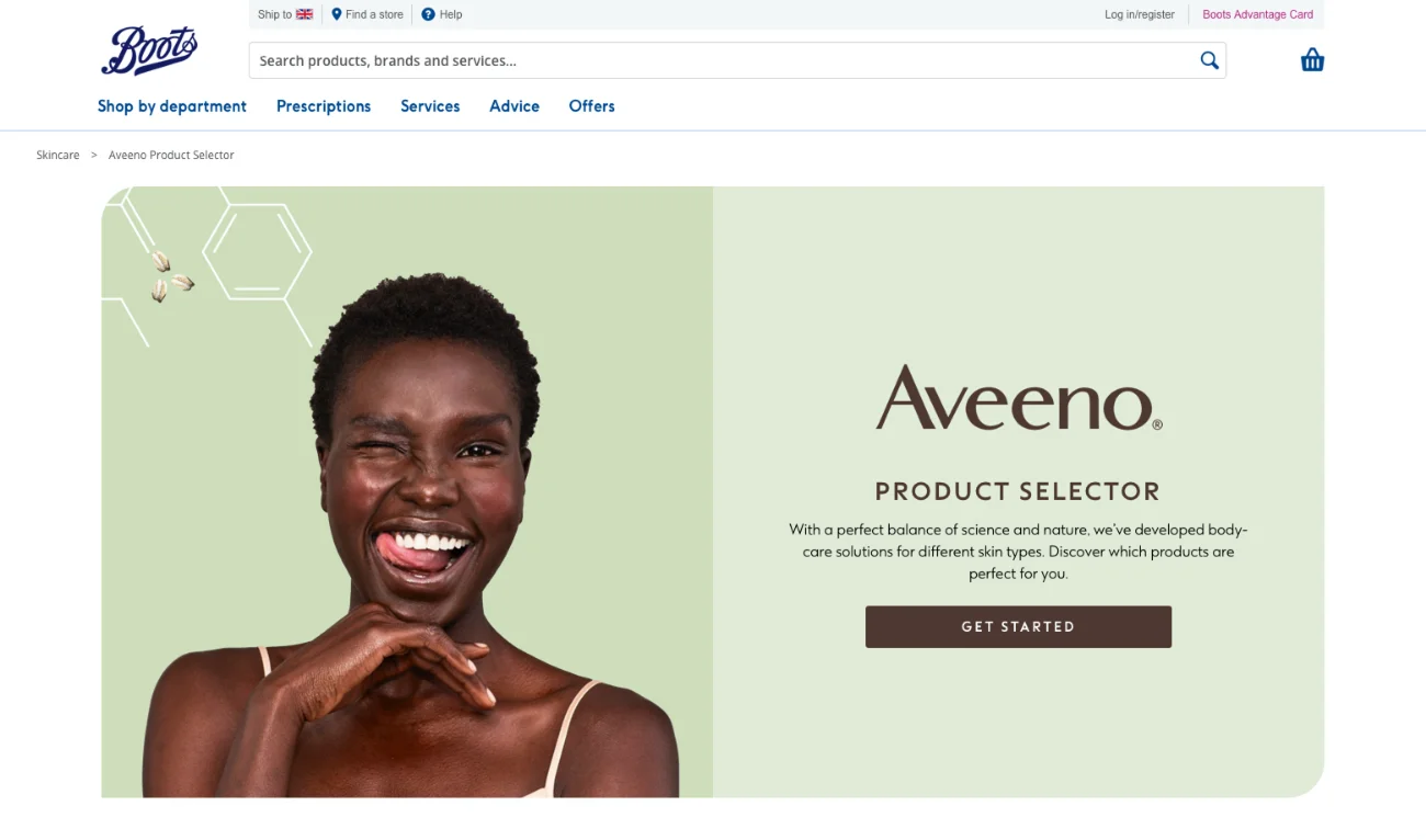
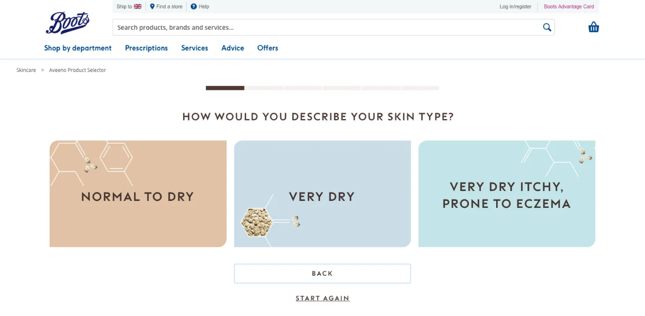
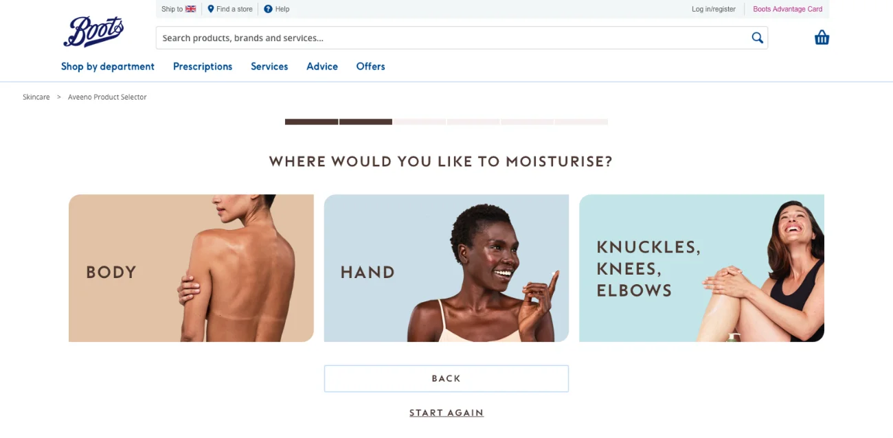
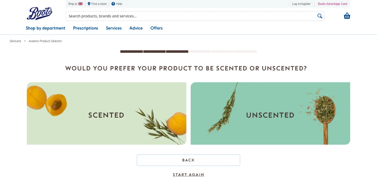
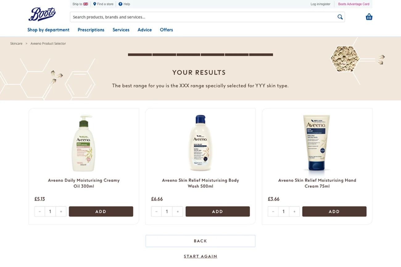
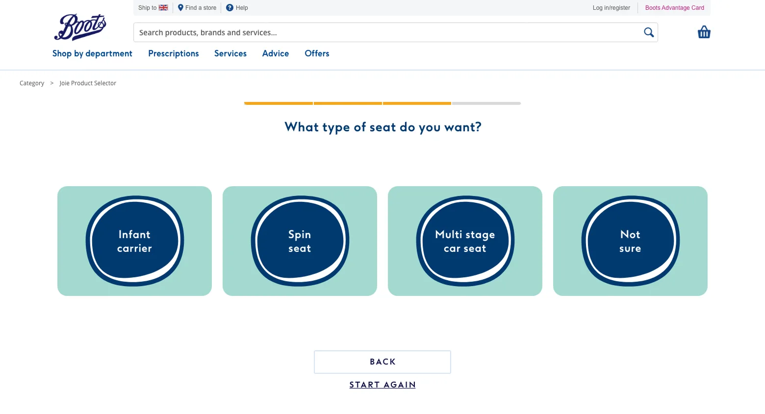
The desktop layout is shown above. Core requirements included a progress indicator and controls allowing users to return to the previous step or restart the selector.
Answers are displayed as large selectable cards, creating a more interactive experience than a conventional form.
A four-column grid governs the answer layout, adapting according to the number of options required.
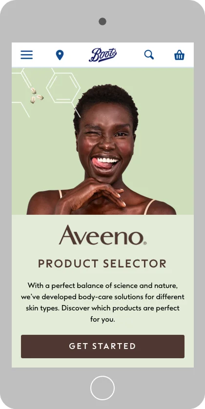
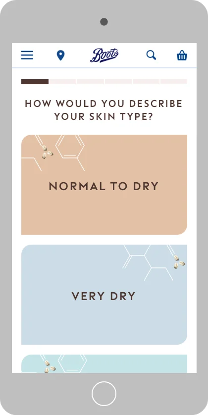
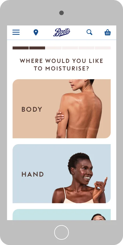
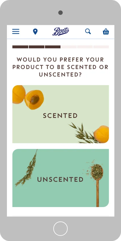
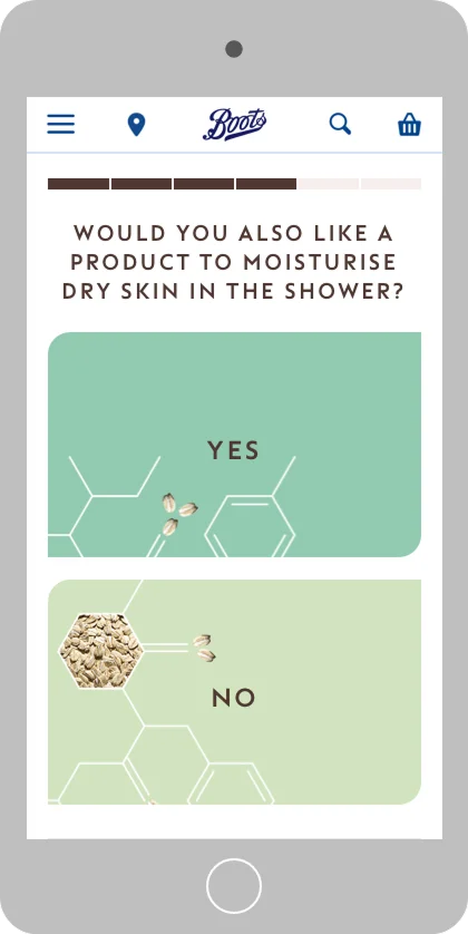
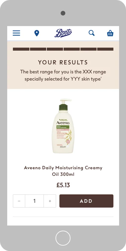
The mobile layout prioritised tap target sizing, ensuring each card could be selected comfortably. Where the number of answers exceeded the available screen space, cards scroll vertically rather than reducing in size.
02
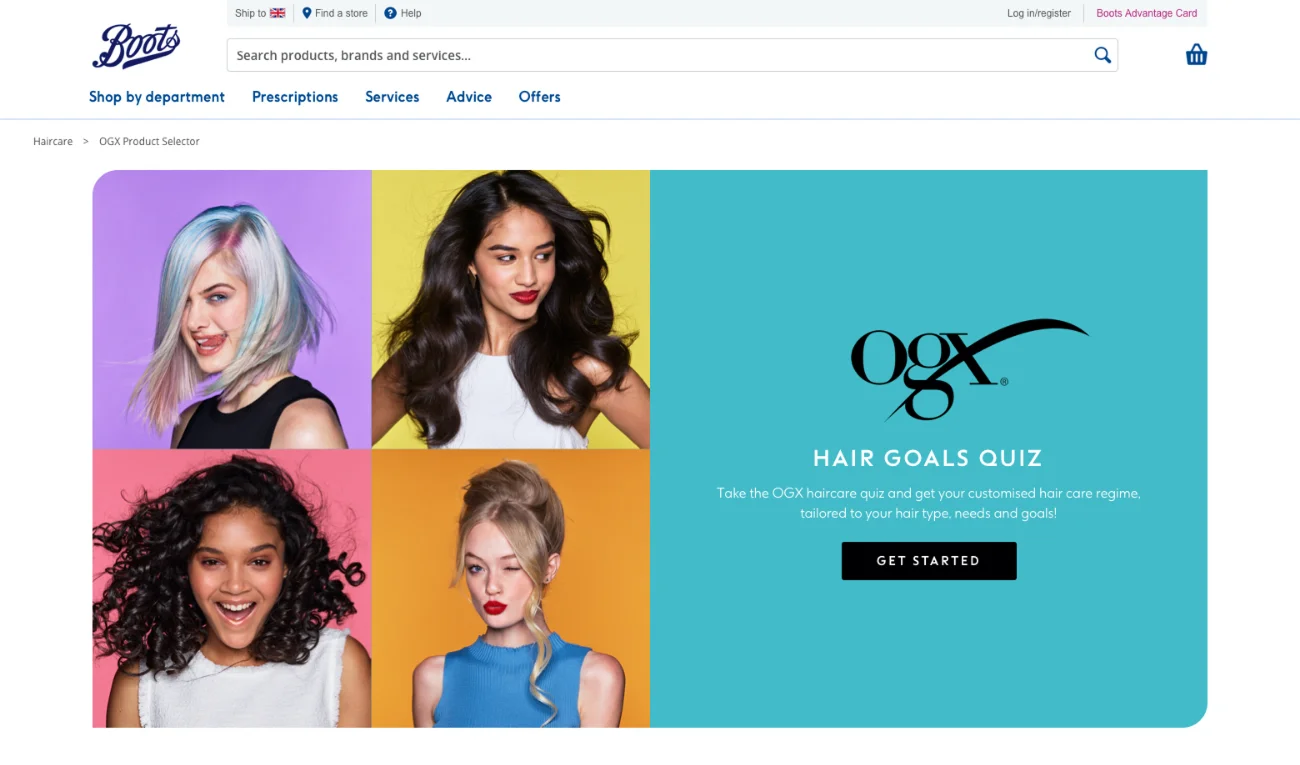
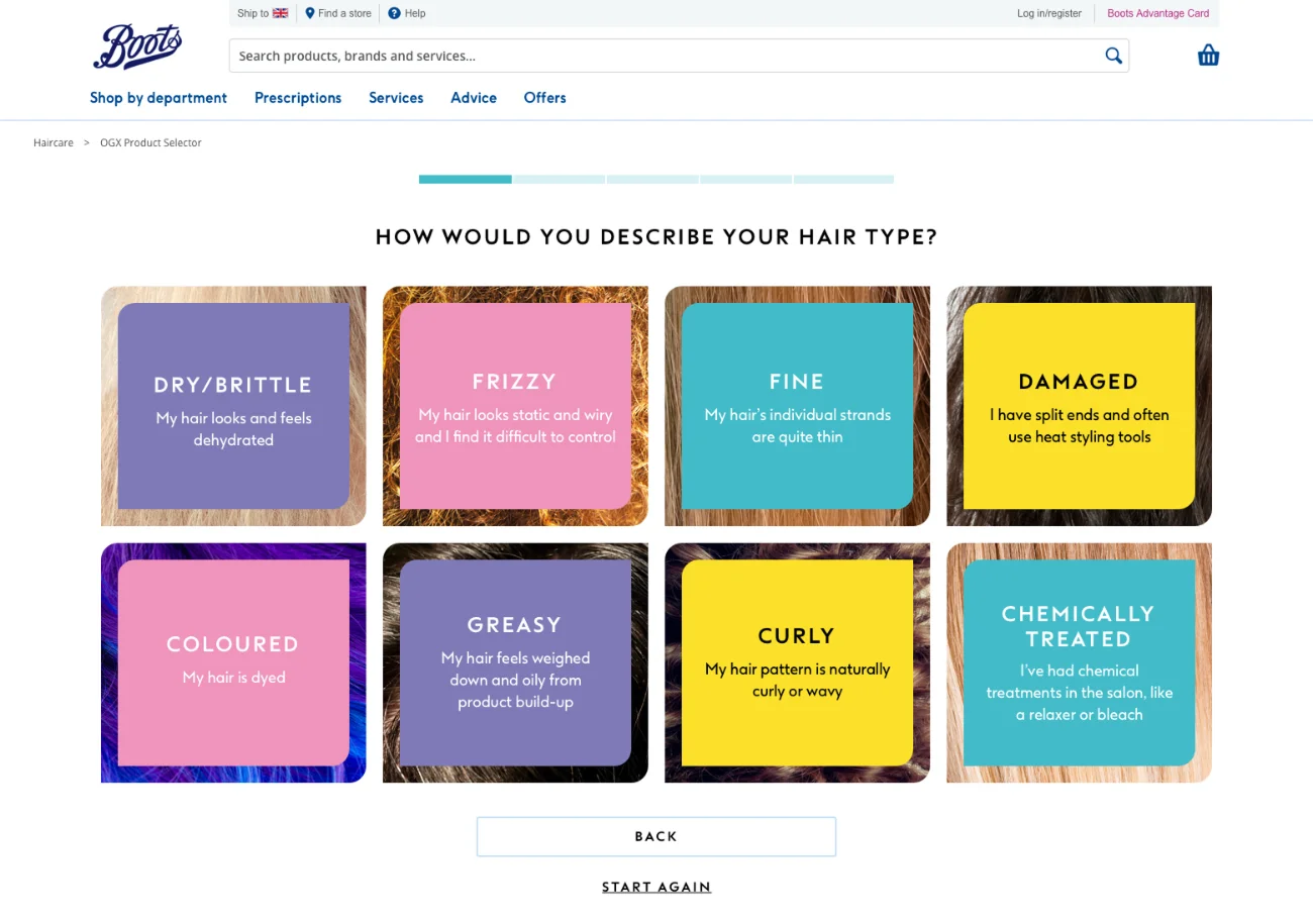
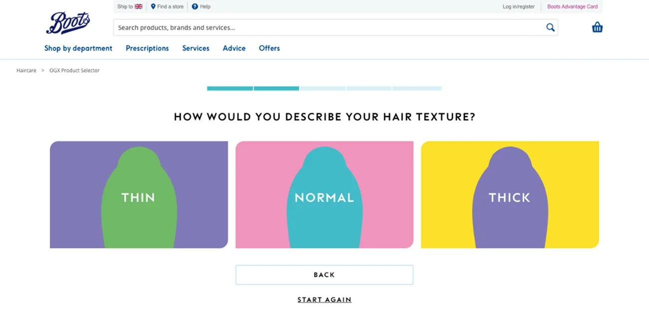
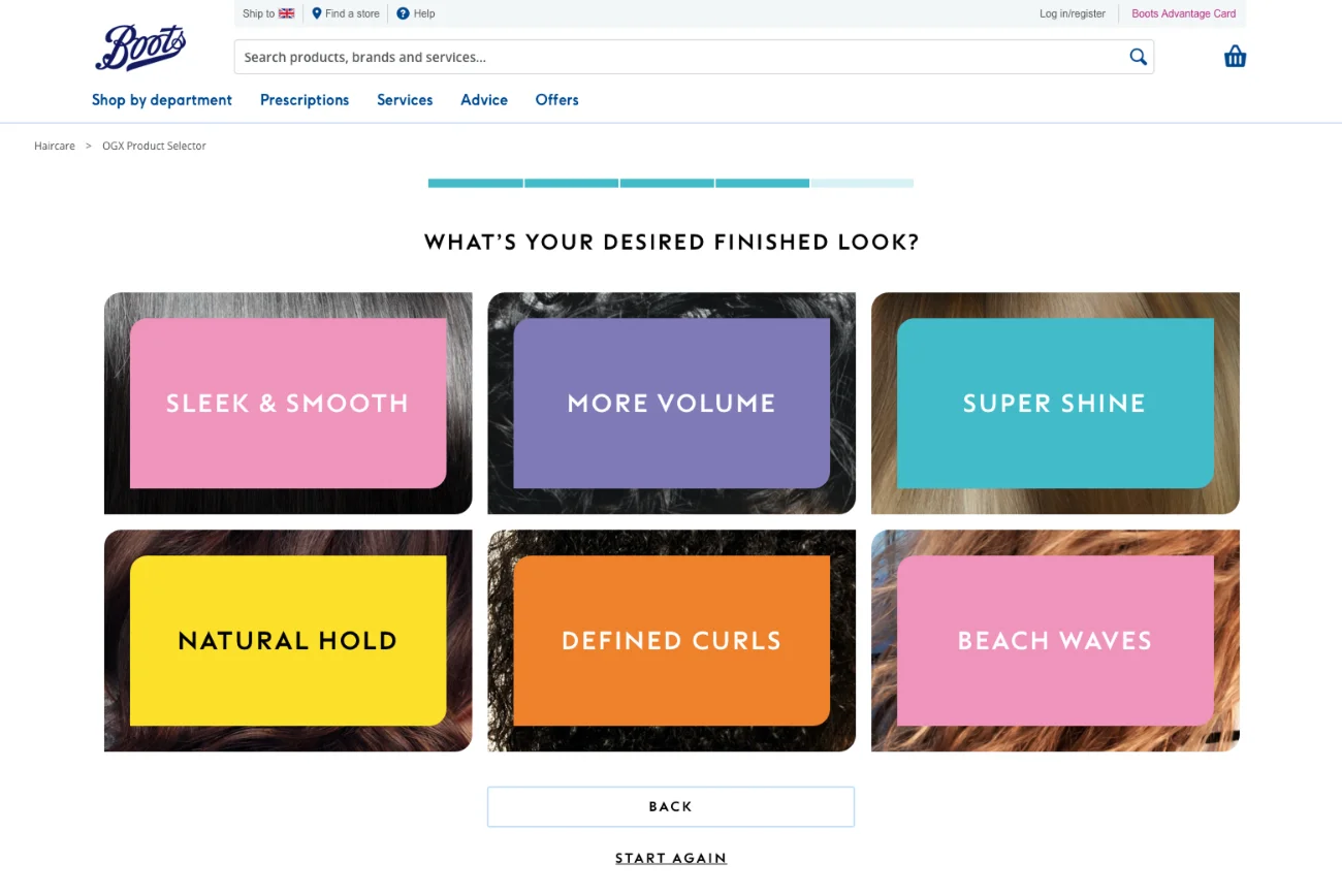
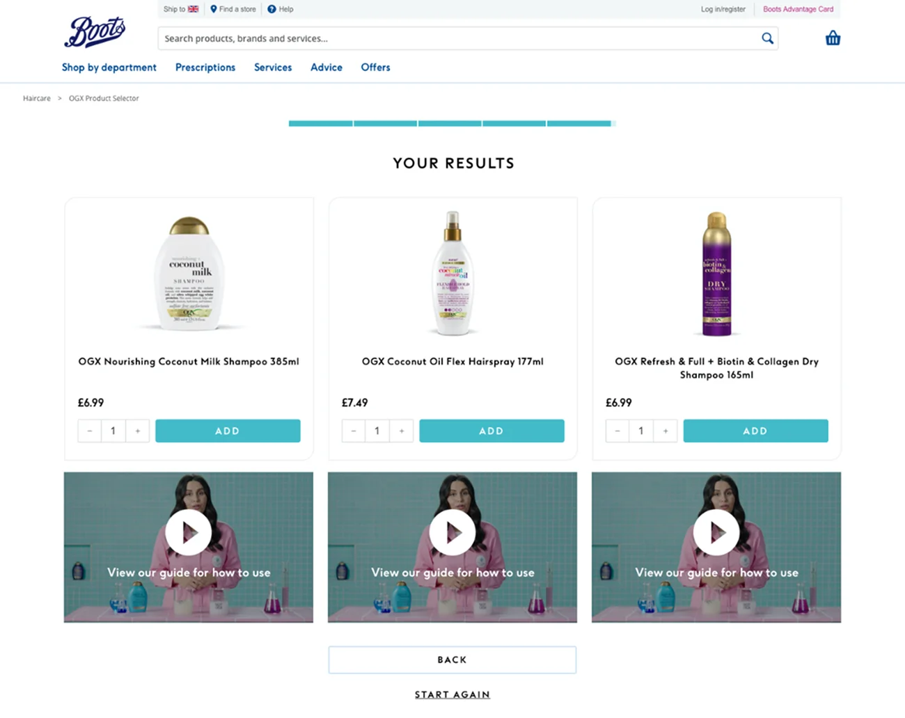
The same underlying layout is applied here, with variation limited to card styling and progress bar colours. This achieves a distinct visual identity without the expense of a bespoke build. The performance of the original selector had already demonstrated that content and styling were the elements requiring adaptation, rather than the layout itself.
03
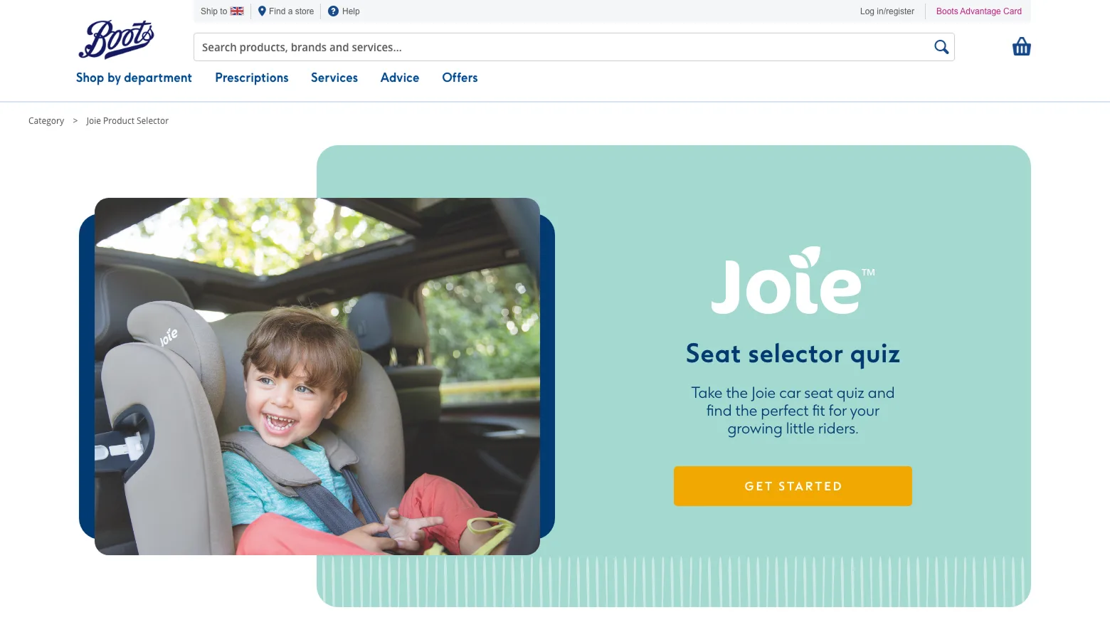
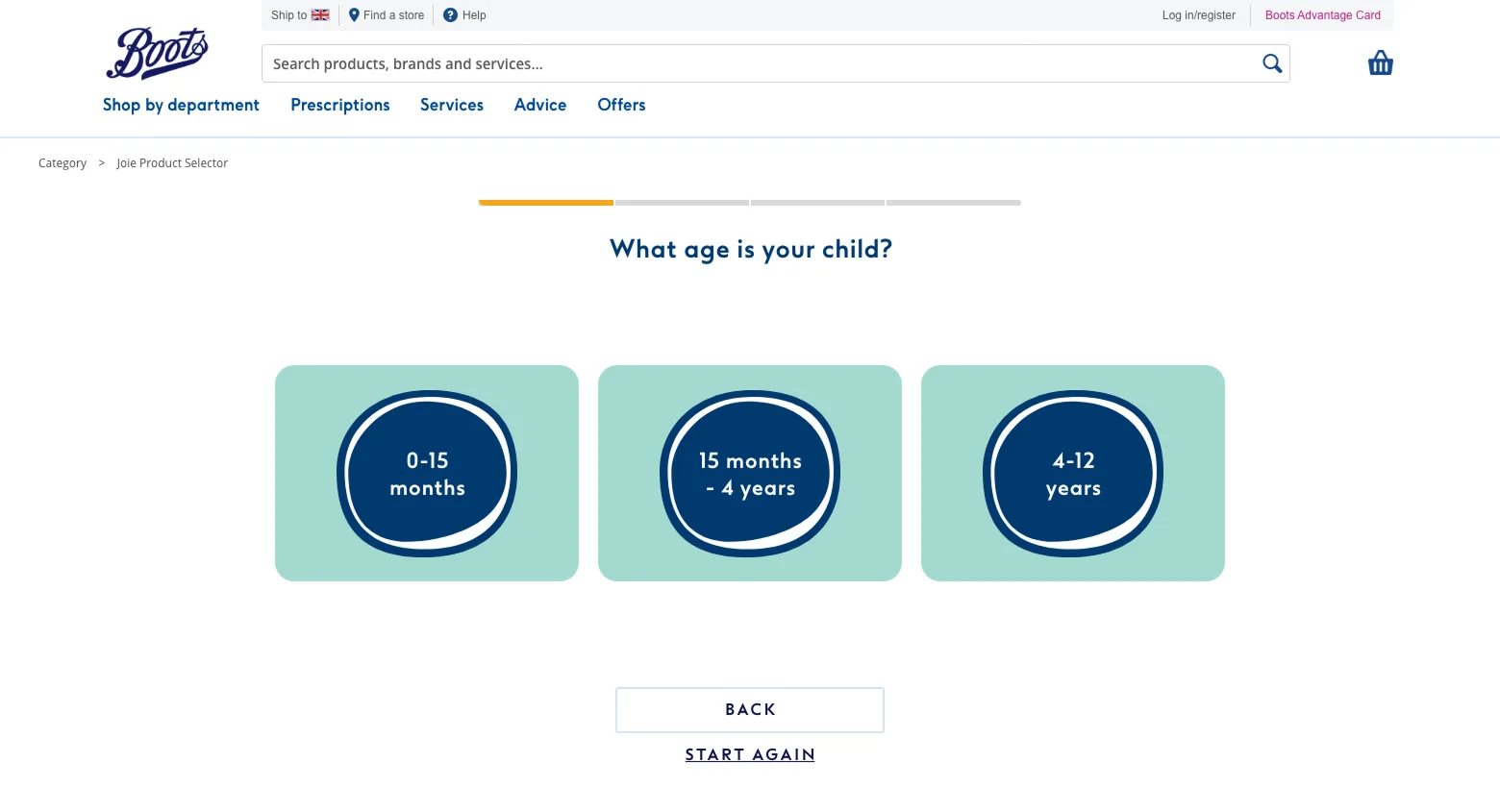
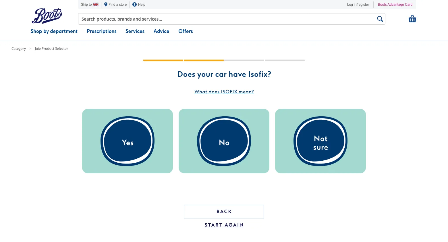
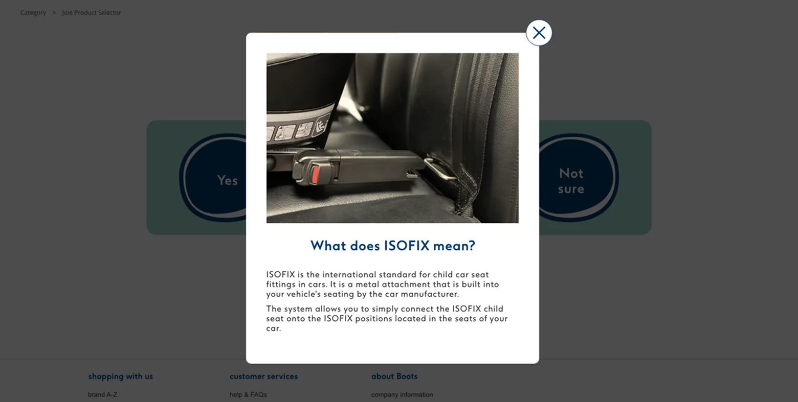
Additional functionality was required for certain selectors. In this instance, overlays were introduced to explain unfamiliar terminology, such as ISOFIX. Given the safety implications of the product category, ensuring customers understood each question was essential.
04
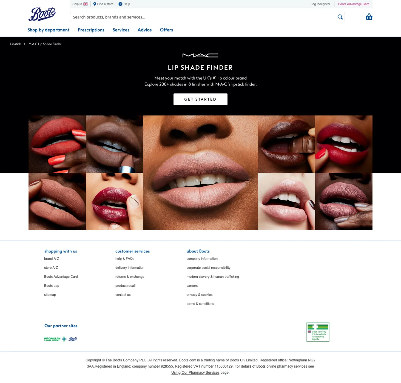
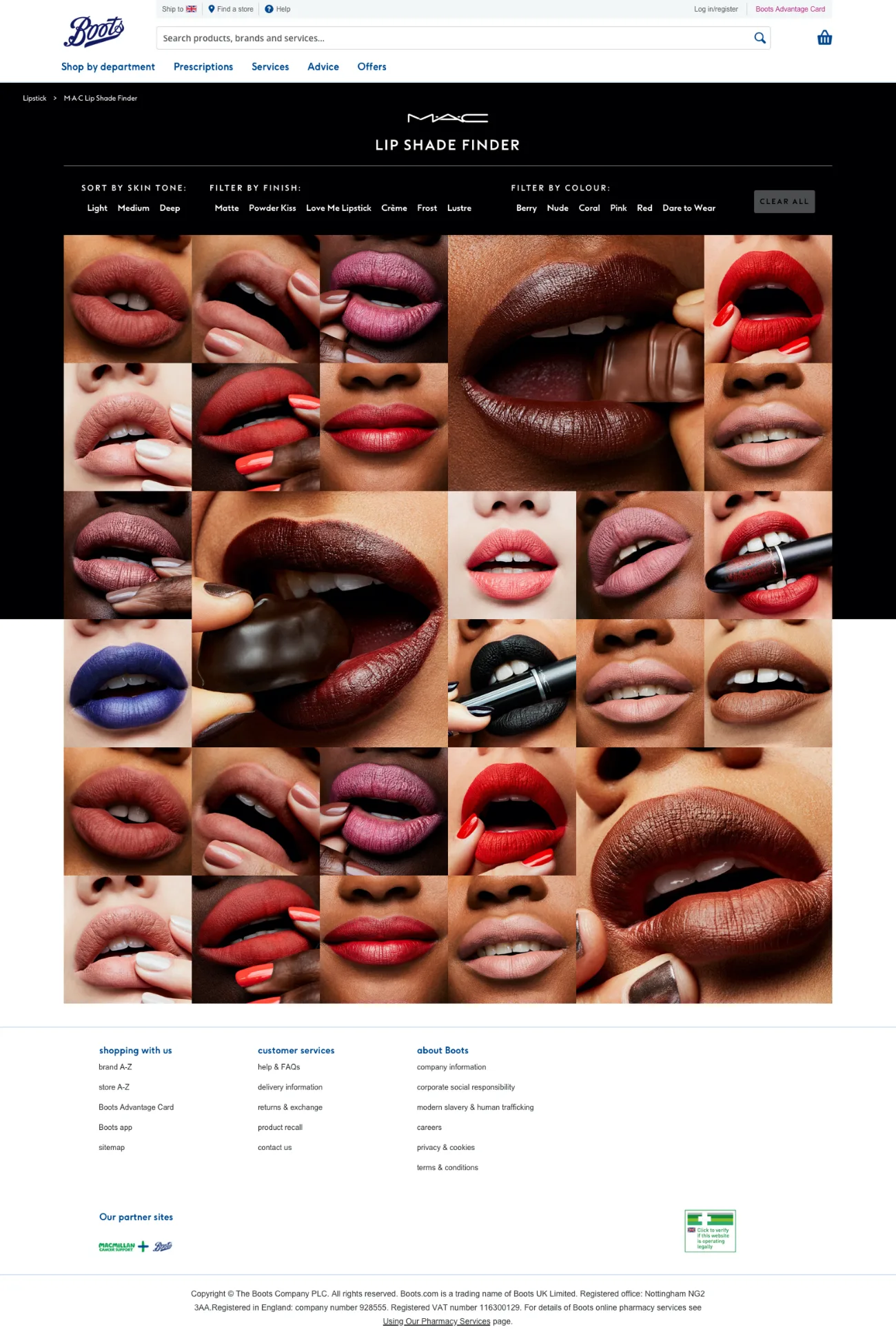
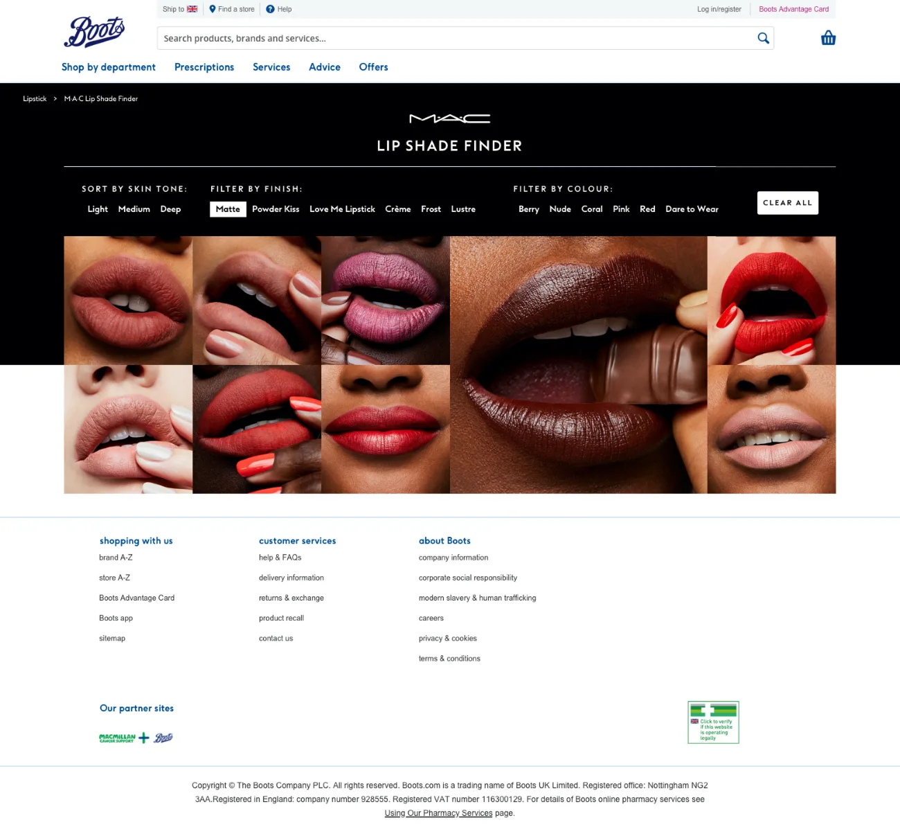
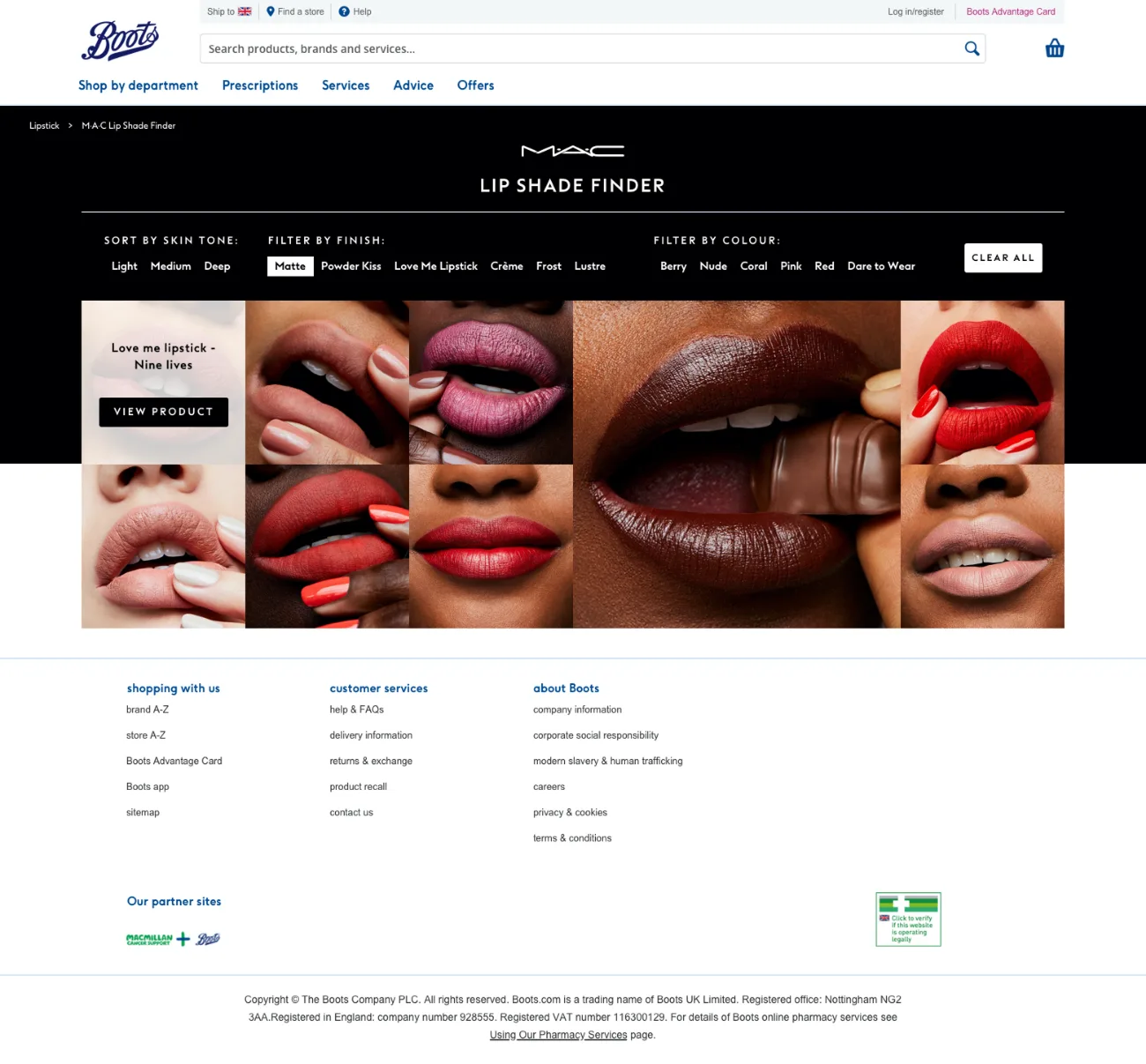
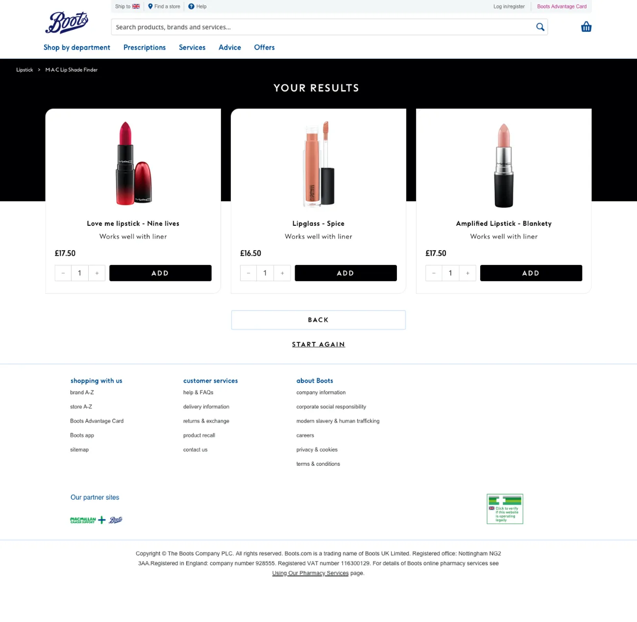
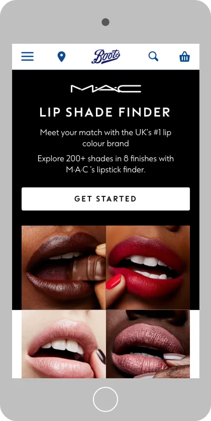
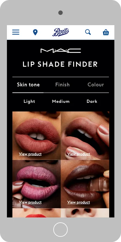
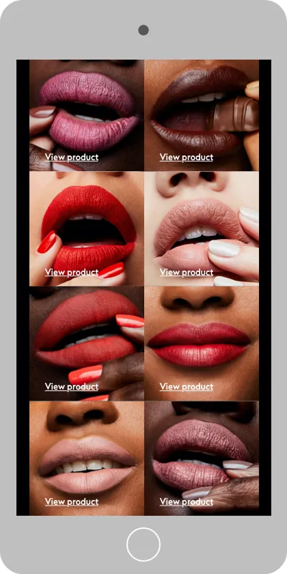
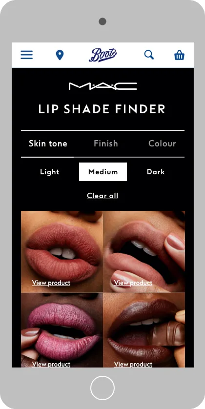
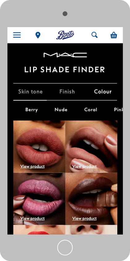
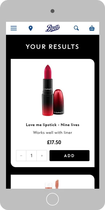
Some selectors needed more than a restyle. Comparing shades means showing a lot of images at once, more than four columns could carry, so the original answer grid had to go.
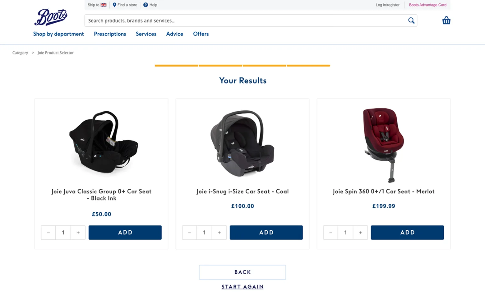
Not all of it, though. The results screen carried over from the original layout unchanged.
The Results


One layout, styled per brand, no changes to the underlying functionality. Costs stayed low, and every brand kept its own identity intact.
This approach established trust across the brands involved and generated repeat enquiries for further product selectors.